Seen, remembered, imitated, unconscious
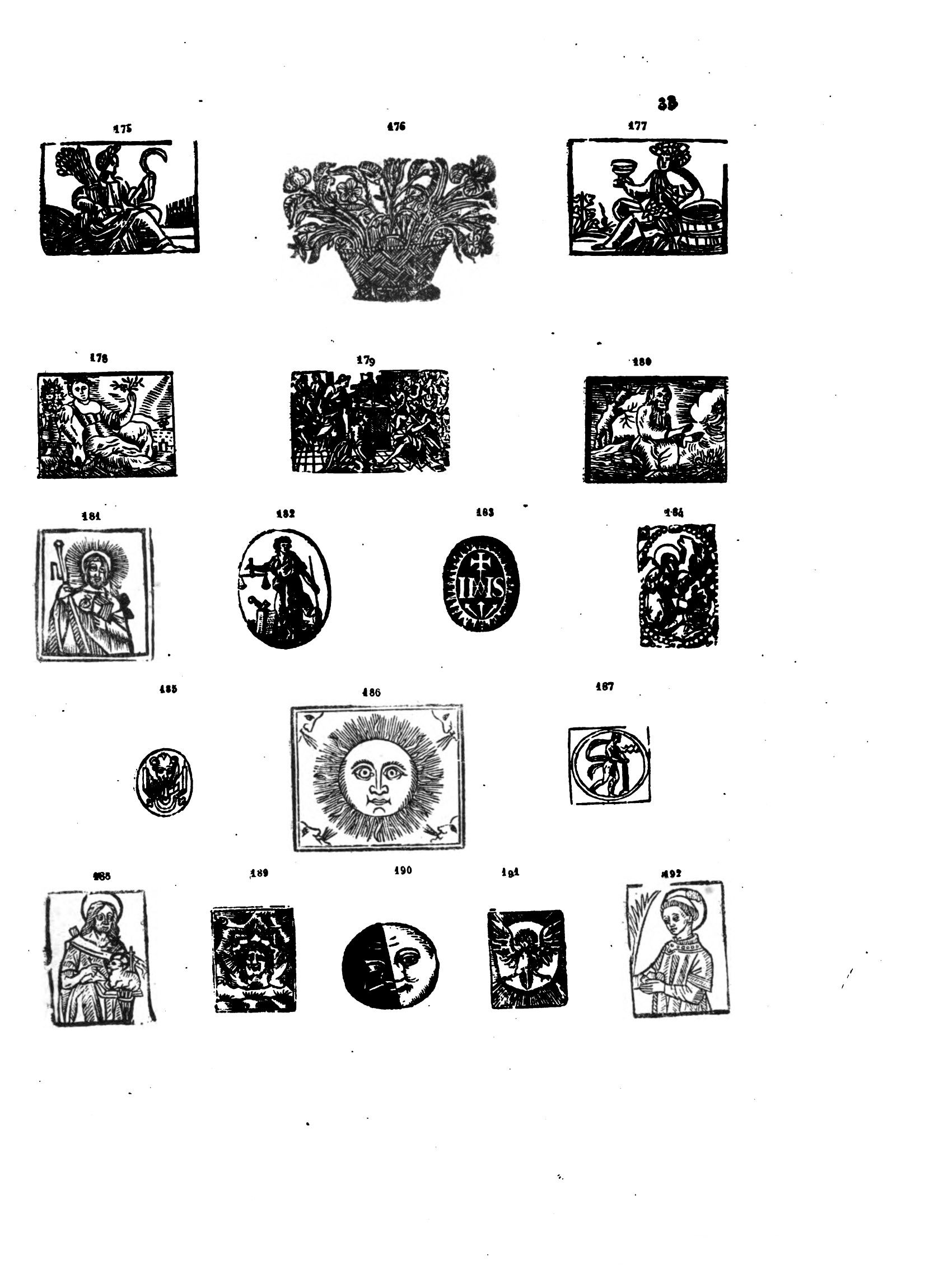
As we explored the extensive Club Collecte catalogue, our gaze was drawn to the yellow cover of Les Aventures du roi Pausole Pierre Louÿs, Les Aventures du roi Pausole [1900], Paris, Club Français du Livre, 1948 , adorned on either side with anthropomorphic depictions of the moon and the sun. These two small engravings feel familiar, since we had come across them a few years earlier in the pages of L’Ymagier L’Ymagier is an art and literature journal founded in 1894 by Alfred Jarry and Rémy de Gourmont. Eight issues were published until 1896. It displayed, without distinction, ancient engravings (old woodcuts from the Bibliothèque Bleue, etchings by Albrecht Dürer) as well as contemporary creations from artists such as Paul Gauguin, Émile Bernard, Henri Rousseau, and wide Epinal prints. Every issue resembled a collection of engravings organised in themes (“monsters”, “knights”, “saints”) and accompanied by texts. https://gallica.bnf.fr/ark:/12148/bpt6k10656488.image , the art journal founded by Alfred Jarry and Rémy de Gourmont in 1894. We know that these images were first printed in an almanac, before being repurposed in 17th-century chapbooks. It seems that these mischievous celestial figures are no strangers to the printed page!
This serendipitous discovery then became the spearhead of research into the layered histories of iconographic material within Club books – tracing their multiple publications, appearances and printings. Our investigation soon focused on the woodcuts of the 15th and 16th centuries, featuring frequently in works designed by Jeanine Fricker, Robert Massin, Jacques Darche and Pierre Faucheux. The fascination of these book designers for ancient popular prints caught our attention as graphic designers, drawn to such mesmerising images.
The rest of this article follows the thread of our discussions (at times, we digress) and attempts to document our findings.
The conversation begins with Jean Giono’s Le Hussard sur le toit Jean Giono, Le Hussard sur le toit [1951], Paris, Club du Meilleur Livre, 1956 , designed by Robert Massin in 1956 for the Club du Meilleur Livre.
ZL
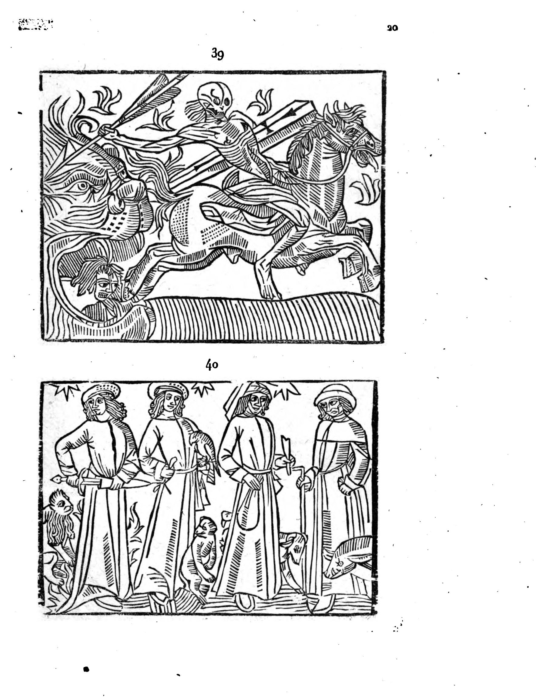
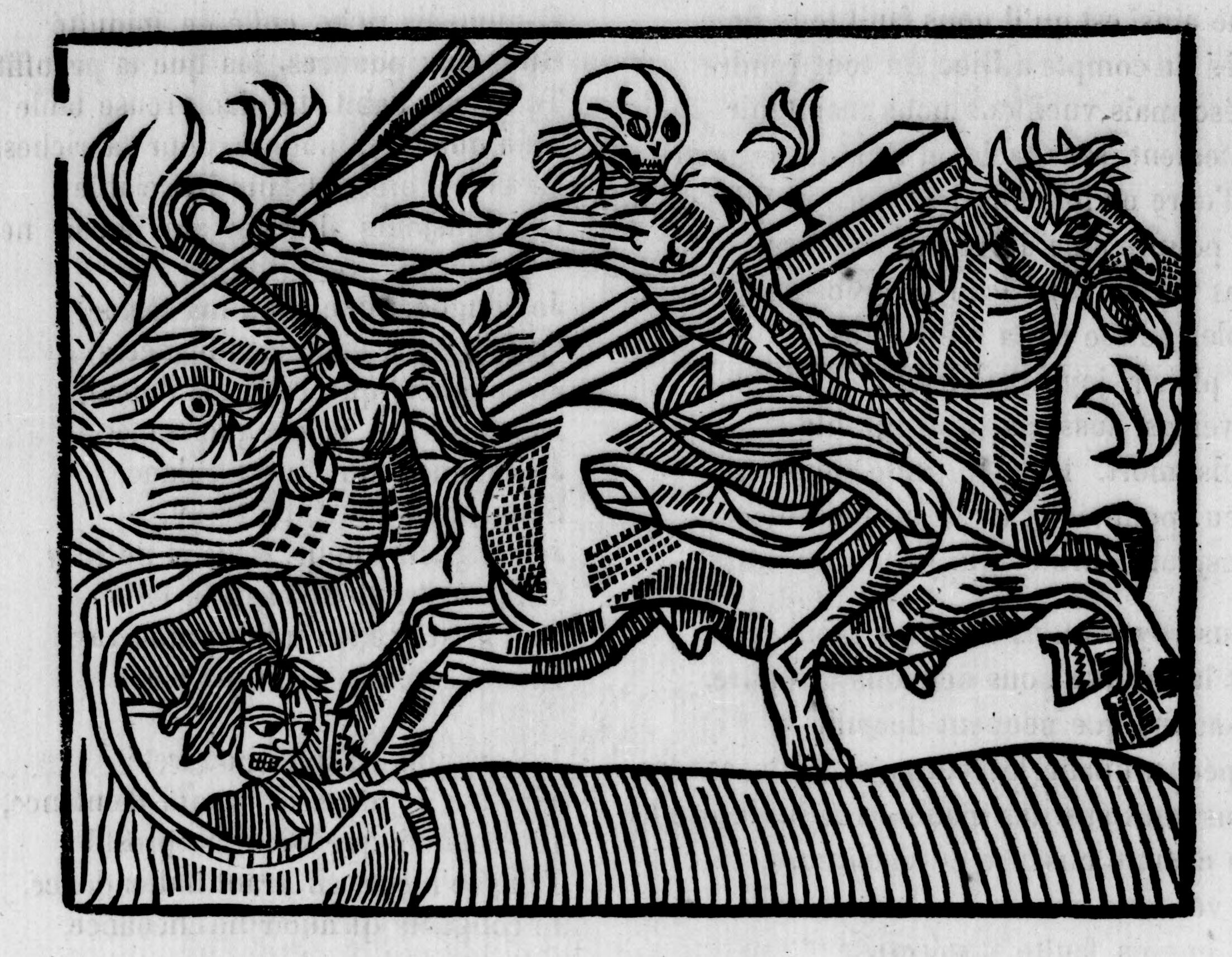
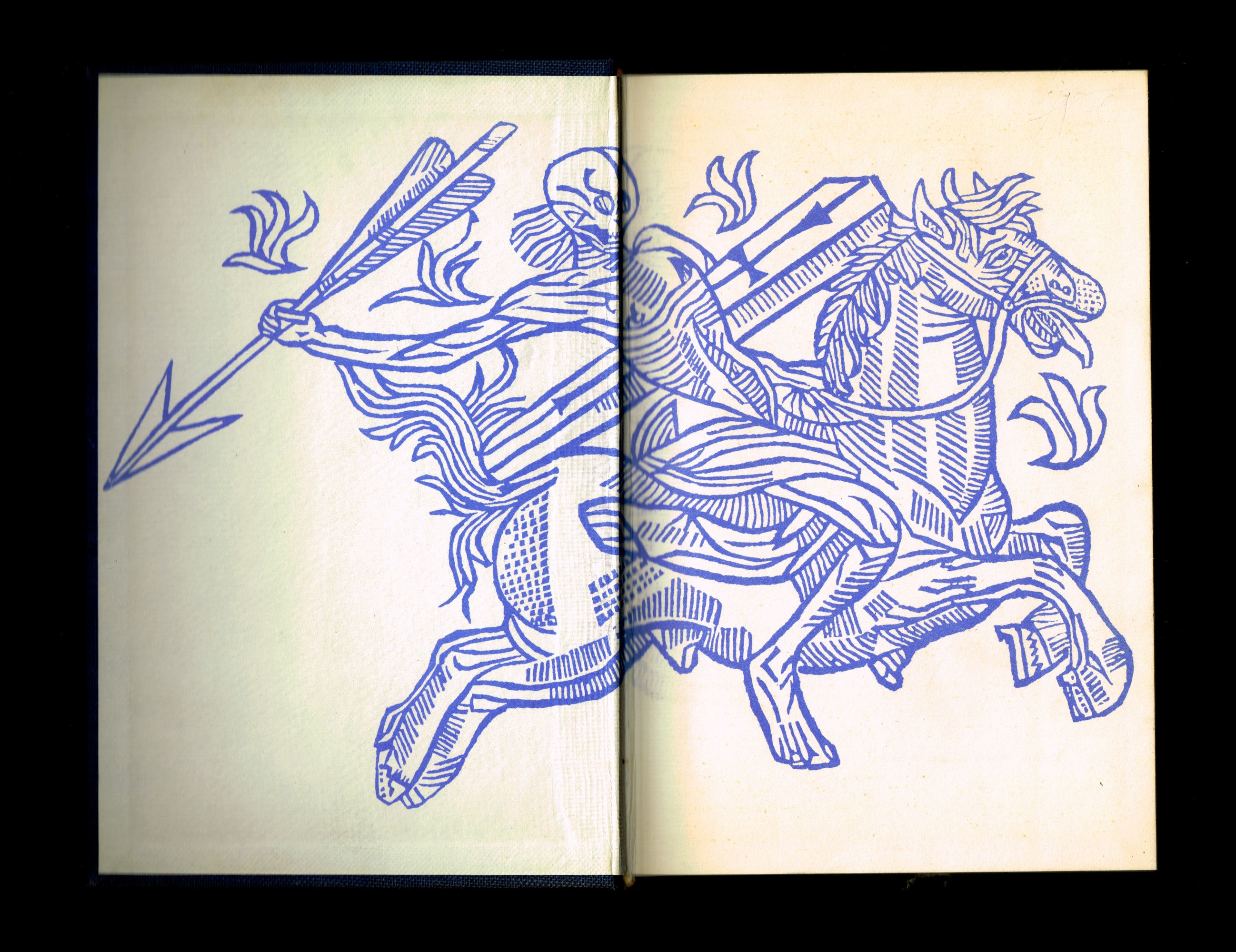
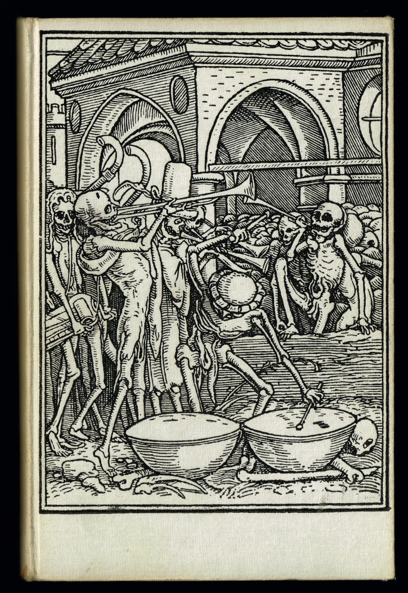
Let’s take the book off the shelf: its cover is simple - only a hussard’s sword adorns the cloth binding. Open it, and the sword turns into an imposing arrow, now wielded by a skeleton astride a winded steed. The image, an old woodcut with thick, naïve lines, fills the entire inside cover page and flyleaf.
MLH
Repeated symmetrically at the end of the book, it envelops Giono’s novel, which tells the story of Angelo Pardi, a young colonel travelling through Provence in the throes of a cholera pandemic.
A sword for the horseman, galloping death for the devastating plague: the different elements of the image, through synecdoque, evoke the very forces that shape the plot.
ZL
On that note, I discovered a 1953 radio adaptation of the novel. In the archive, Jean Giono’s melodious voice declares “The Hussard is a story that begins at a horse’s walk and then gallops on” [Online] https://www.youtube.com/watch?v=-2gOg1LhABE&ab_channel=LeS%C3%A9maphore . Massin designed the book three years after the broadcast. Perhaps he had heard the author’s words and decided to translate them into images.
MLH
That is one hypothesis. But to better unravel Massin’s choices, it would be interesting to take a closer look at the history of this particular engraving. Where is it from? What life(s) might it have led before gracing the cover of Le Hussard sur le toit?
ZL
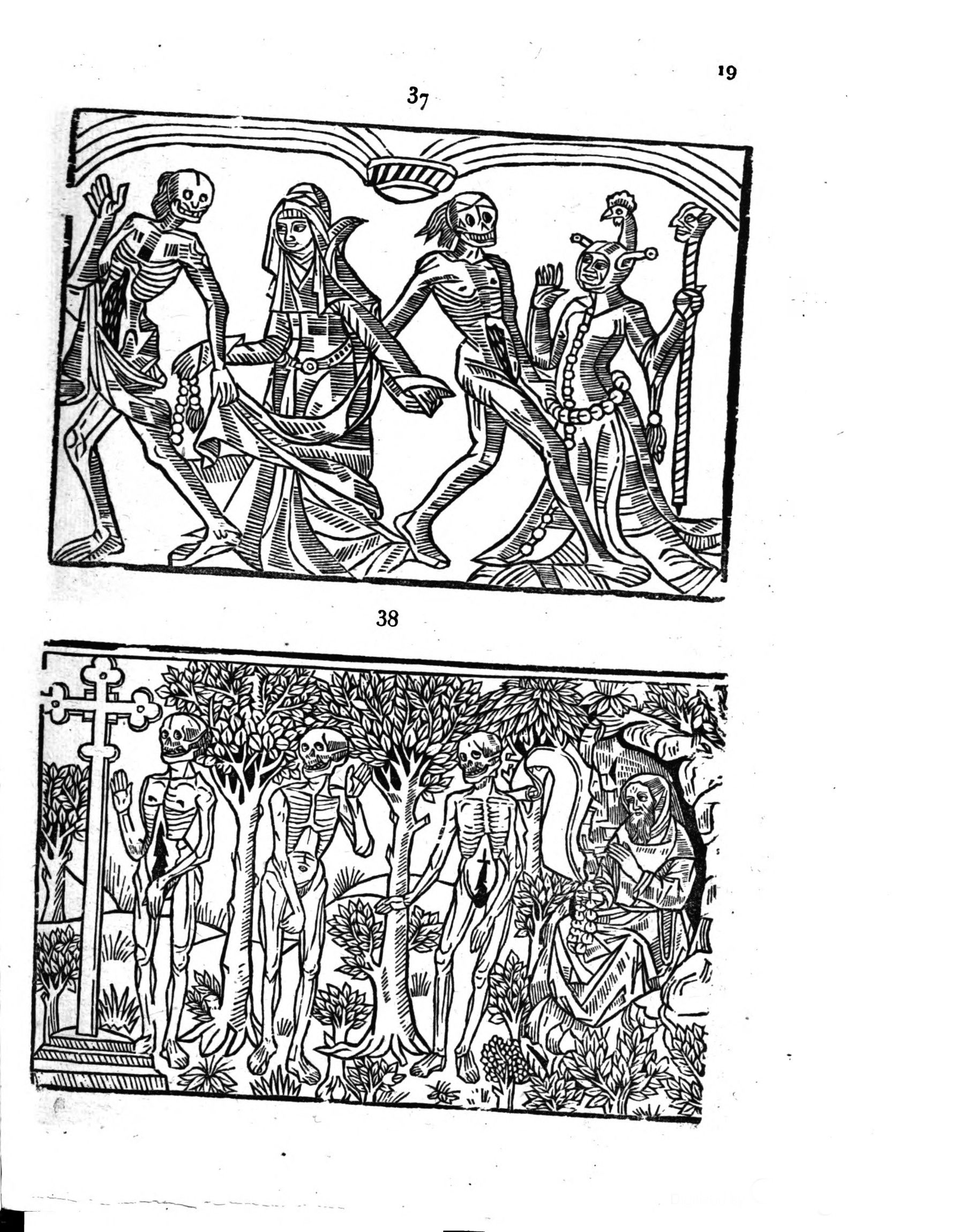
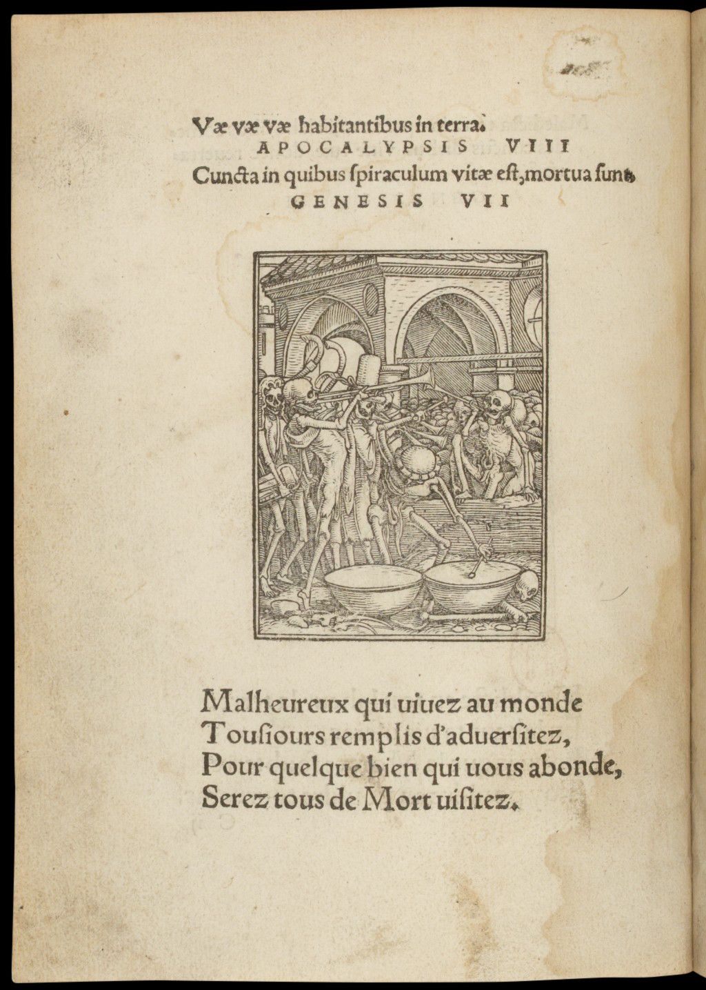
The engraving is taken from a danse macabre, a widespread theme in the late Middle Ages, highlighting the vanity of social distinctions, since Death claims both emperor and peasant alike. Danse macabre scenes always unfold as a series of illustrations depicting every layer of society. Men, women and skeletal figures dance hand in hand, forming a great winding procession.
As I ponder this Death on horseback and examine its appearances, I realise it comes in countless variations. The image is sometimes engraved with subtle stylistic differences La grant danse macabre des hommes et des femmes historiee et augmentee de beaulx dis en latin…, Lyon, Claude Nourry, 1501 https://gallica.bnf.fr/ark:/12148/bpt6k1510028q/f44.item , sometimes reproduced identically.
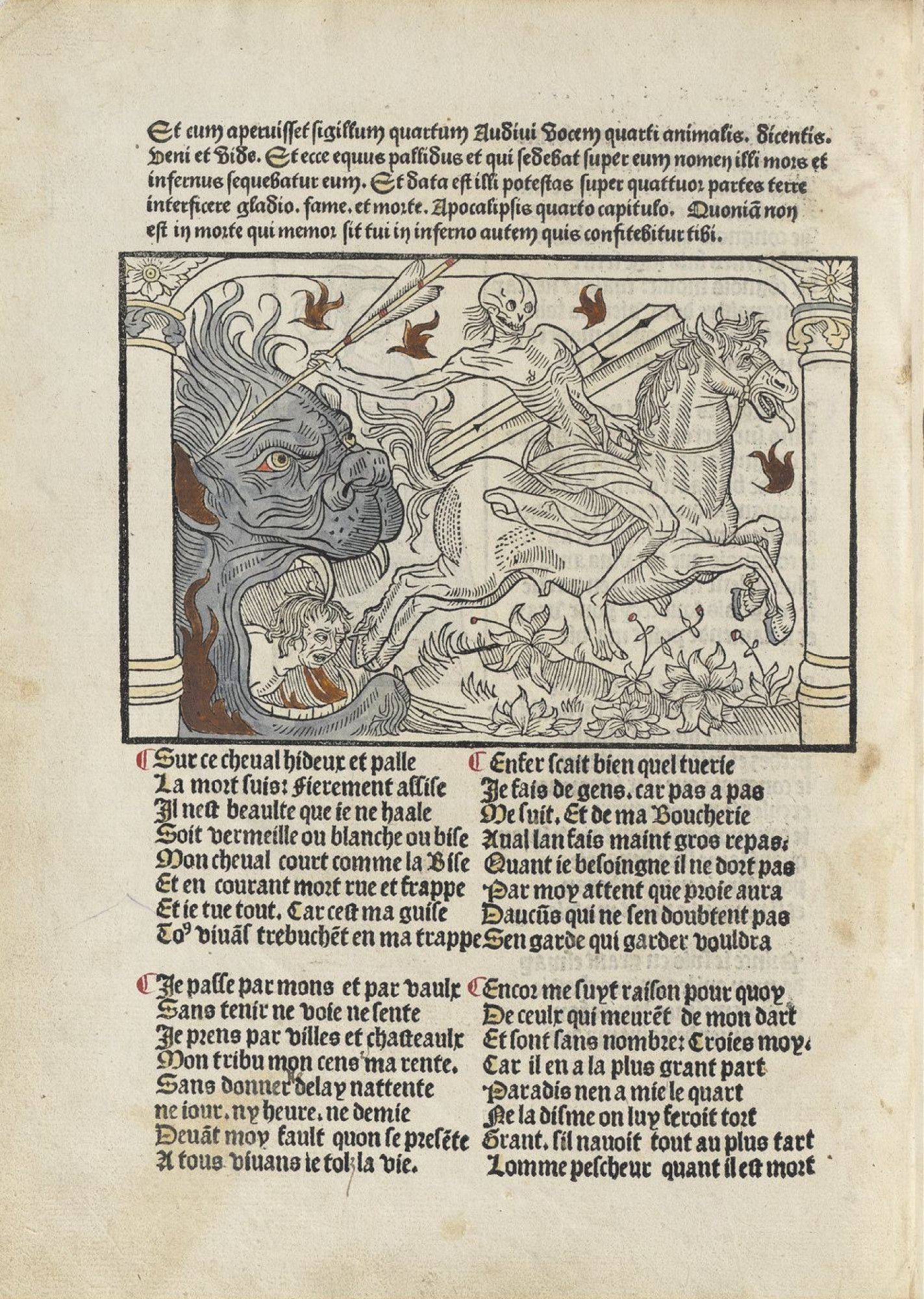
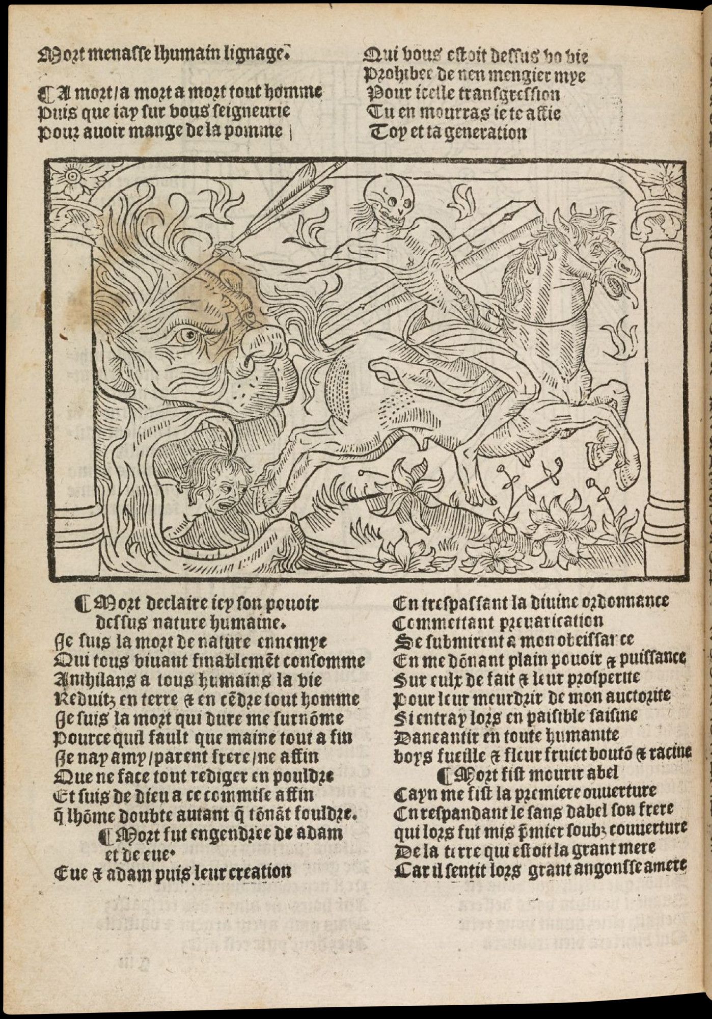
The engraving found at the beginning of Giono’s novel first appeared in a popular 15th century work, which can no longer be found today. This disappeared edition was reissued in 1862 by the librairie Baillieu (Paris) : La grande danse macabre des hommes et des femmes, Paris, Librairie Baillieu, 1862
It resurfaced in 1850 when Louis Varlot (antique dealer and publisher) released a collection of images entitled Illustration de l’ancienne imprimerie Troyenne Illustration de l’ancienne imprimerie troyenne, Troyes, Varlot, 1850 https://books.google.fr/books?id=gJkOAAAAQAAJ&printsec=frontcover&hl=fr#v=onepage&q&f=true which compiled many old engravings, in board form. At the beginning of the book, over twenty pages depict a danse macabre that culminates with our deceased knight.
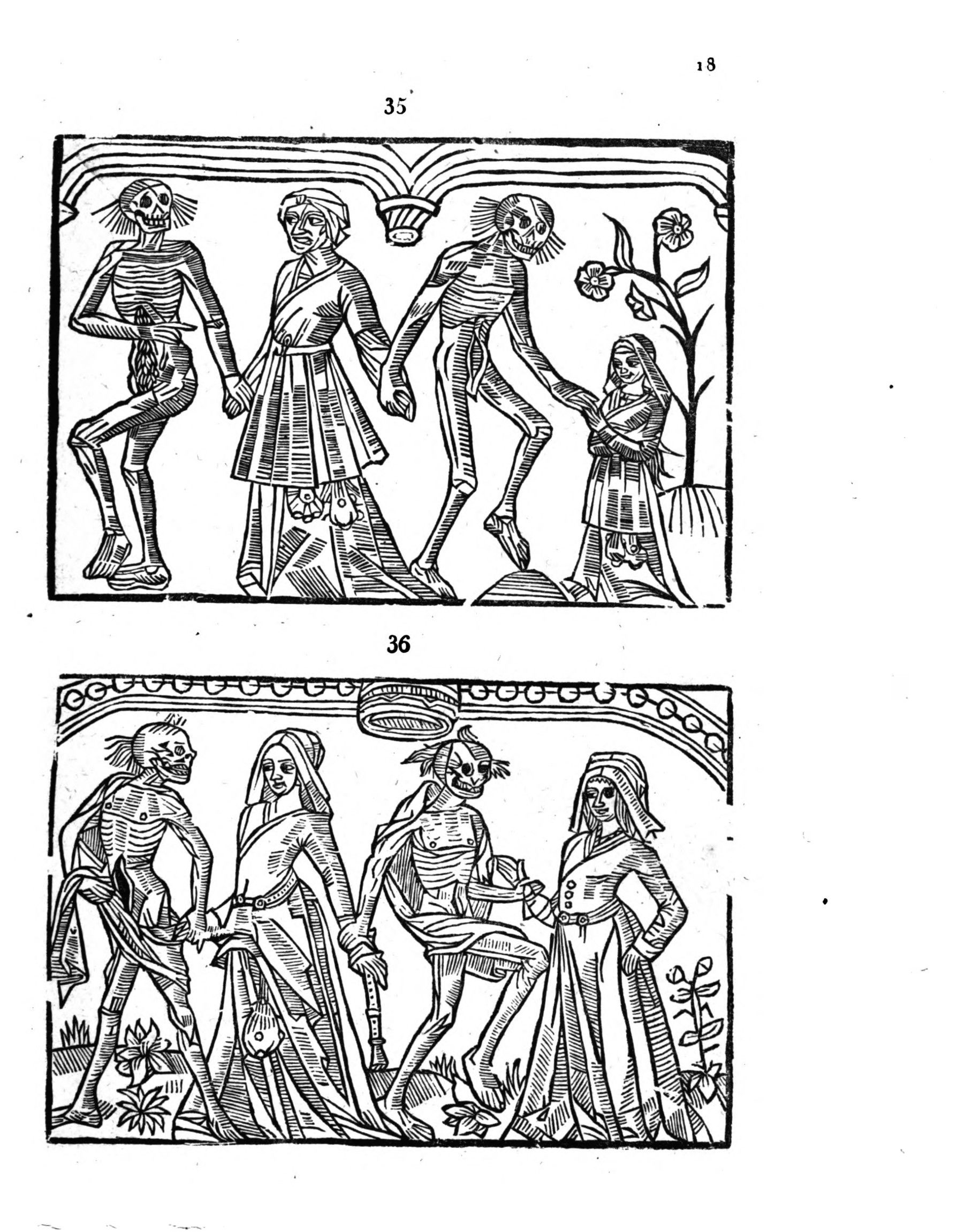
A second volume came to light in 1859, prefaced by “a letter from the bibliophile Jacob” who assured readers that this new collection “will meet the same enthusiasm among bibliophiles and iconographers” Xylographie de l’imprimerie troyenne, Troyes, Varlot, 1859 . Indeed, the combined 781 engravings in both volumes are a treasure trove for anyone interested in historical imagery. I can easily imagine Alfred Jarry and Remy de Gourmont scouring these pages for unusual prints – monsters, knights, and other curiosities - to reproduce in l’Ymagier L’Ymagier is an art and literature journal founded in 1894 by Alfred Jarry and Rémy de Gourmont. Eight issues were published until 1896. It displayed, without distinction, ancient engravings (old woodcuts from the Bibliothèque Bleue, etchings by Albrecht Dürer) as well as contemporary creations from artists such as Paul Gauguin, Émile Bernard, Henri Rousseau, and wide Epinal prints. Every issue resembled a collection of engravings organised in themes (“monsters”, “knights”, “saints”) and accompanied by texts. . Several engravings from their journal do appear in these collections. This is the case for the human-faced celestial bodies mentioned above, as well as other images that also resurface in some Club books.
But let’s return to Giono’s novel. Upon opening Le Hussard sur le toit, it is evident that Massin transformed the knight’s image. Much of the original engraving has been removed, leaving only the central figure; the image has been enlarged to fill the entire double-page spread; and the choice of blue ink breathes new life into the old print, harmonising it with the book’s cloth binding.
MLH
Ultimately, paired with Giono’s narrative, the engraving takes on a whole new interpretation, a contextualised reading, far removed from danse macabre and other rhythmic processions.
ZL
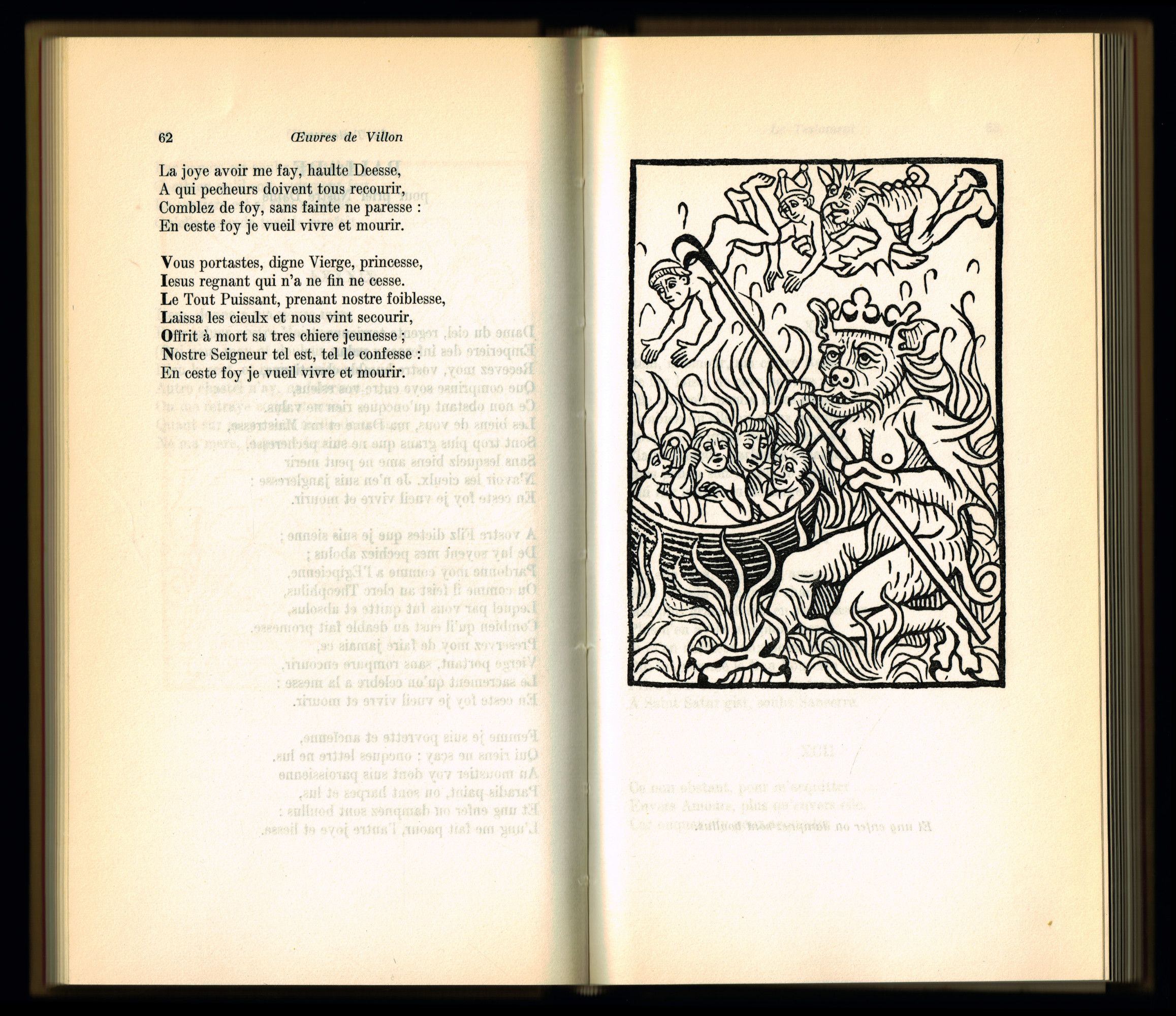
Indeed, browsing through the Club Collecte archives reveals other depictions of these deadly dances. For instance, a Hans Holbein the Younger engraving Jean de Vauzelles, Les simulachres & historiees faces de la mort, autant elegamment pourtraictes, que artificiellement imaginées, Lyon, Librairie Soubs l’escu de Coloigne, 1538 https://gallica.bnf.fr/ark:/12148/bpt6k1048547w/f32.item illustrates the cover page of Camus’ La Peste Albert Camus, La Peste [1947], Paris, Club du Meilleur Livre, 1955 . The book was also designed by Massin a year before Giono’s novel. Both literary works share terrifying, allegorical diseases at their core.
MLH
When exploring the catalogue, I was struck by how many engravings revolve around death, directly or indirectly. I don’t know whether it’s because it is a very common theme in these kinds of images or whether the book designers deliberately intended to play with this relationship to time.
ZL
Death is indeed present in many forms throughout these medieval popular prints. At the time, religion was deeply influential, emphasizing the futility of life, and thus its finite character.
It can lurk in the guise of the Devil, like in Francois Villon’s Œuvres François Villon, Œuvres [XVIe siècle], Paris, Club du Meilleur Livre, 1959 , designed by Jeanine Fricker in 1959 (who repurposed a 15th-century engraving here Peter Drach, Der spiegel der menschen behaltnis mit den ewangelien vnd mit epistelen nach der zyt des iars,1480 ).
MLH
This leitmotiv extends even to the process of “iconographic reissuing” itself. Club book designers carried out a kind of exhumation of images: by restaging and repaginating them, they brought these ancient engravings back to life. Perhaps to ensure they would never die? Or rather, to make them live forever, always in new forms?
ZL
Like ghost images haunting publications. But the relationship with time goes beyond this analogy to death: it takes on a thousand forms through the many facets of books.
MLH
Absolutely. The question of temporality is inherent to the very concept of the Club phenomenon, which offers a wide range of texts, most of which are reissues. The act of reissuing implies a genuine shift: the literary work is plucked from the past and placed in a new present, undergoing various transformations.
A similar process occurs with images. The relationship to time is particularly visible and manifests itself in different ways, sometimes highlighted, sometimes intentionally obscured.
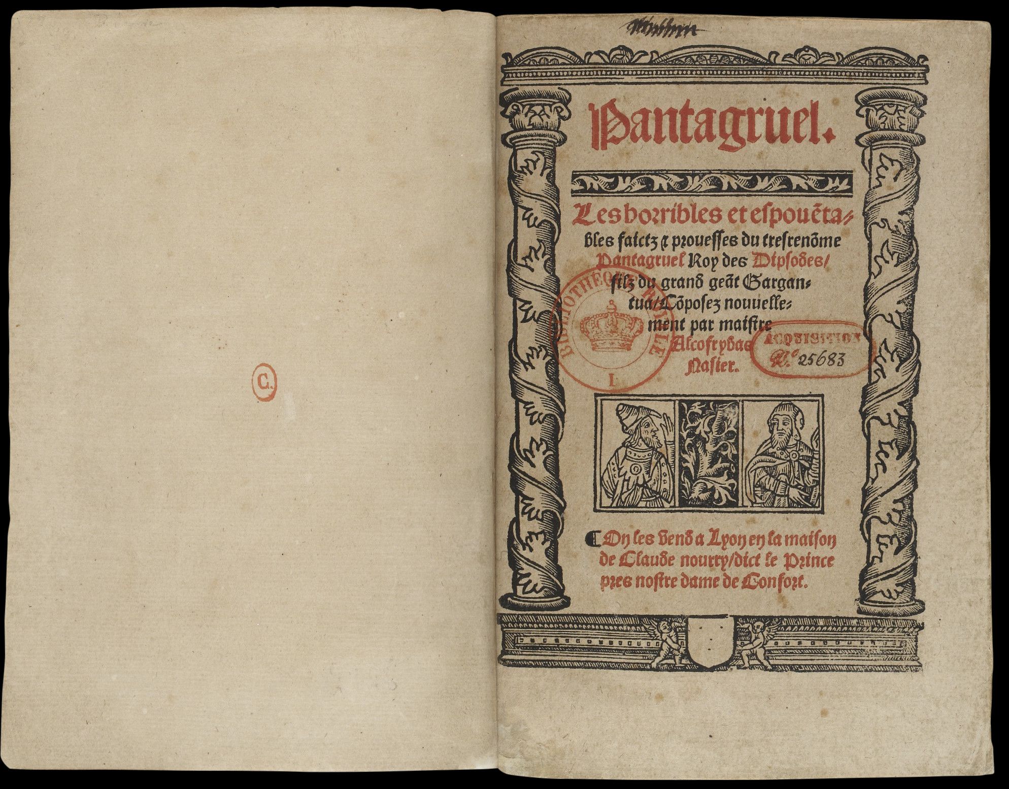
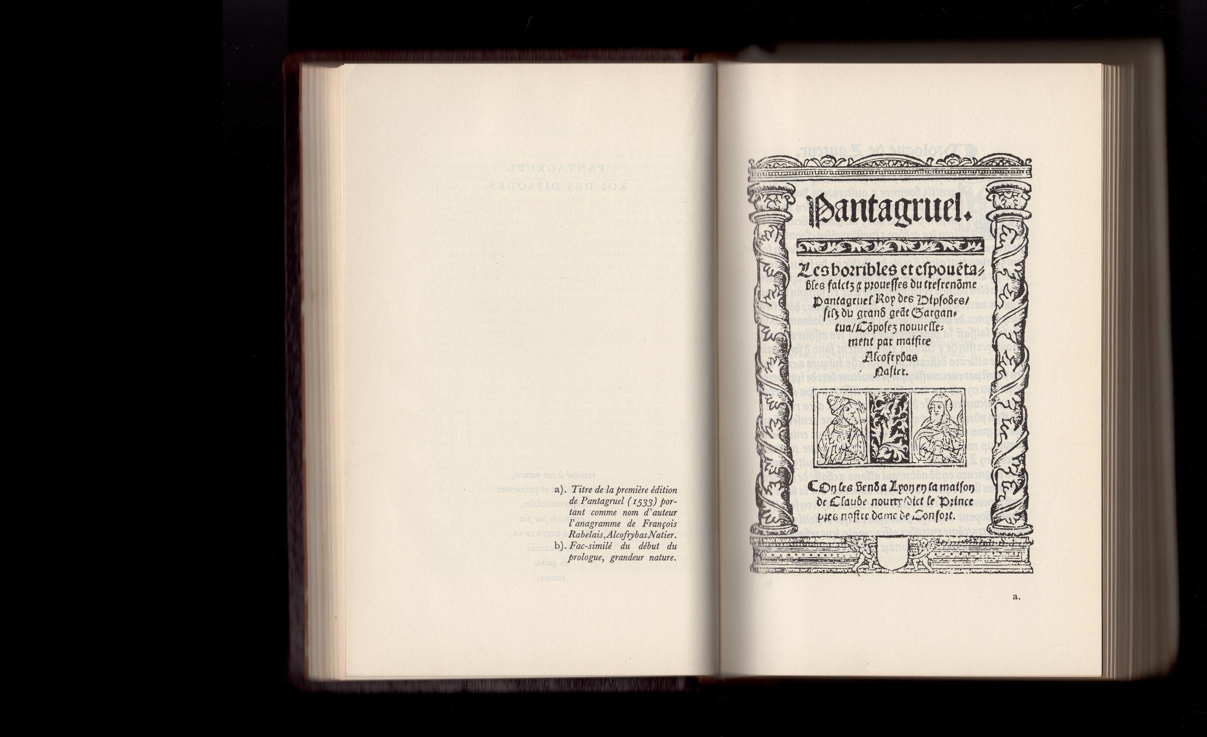
Every image carries its own history and form, and reissuing can become an opportunity to pay tribute to these original characteristics. This is evident in the reissue of Rabelais’ Œuvres complètes François Rabelais, Pantagruel [1532], Paris, Club du Meilleur Livre, 1962 . The Club Français du Livre faithfully reproduced the form and composition of the frontispiece from the original 1532 edition François Rabelais, Les horribles et espoventables faictz et prouesses du très renommé Pantagruel, roy des Dipsodes, filz du grand géant Gargantua…, Lyon, C. Nourry, 1532. , at the beginning of the book.
ZL
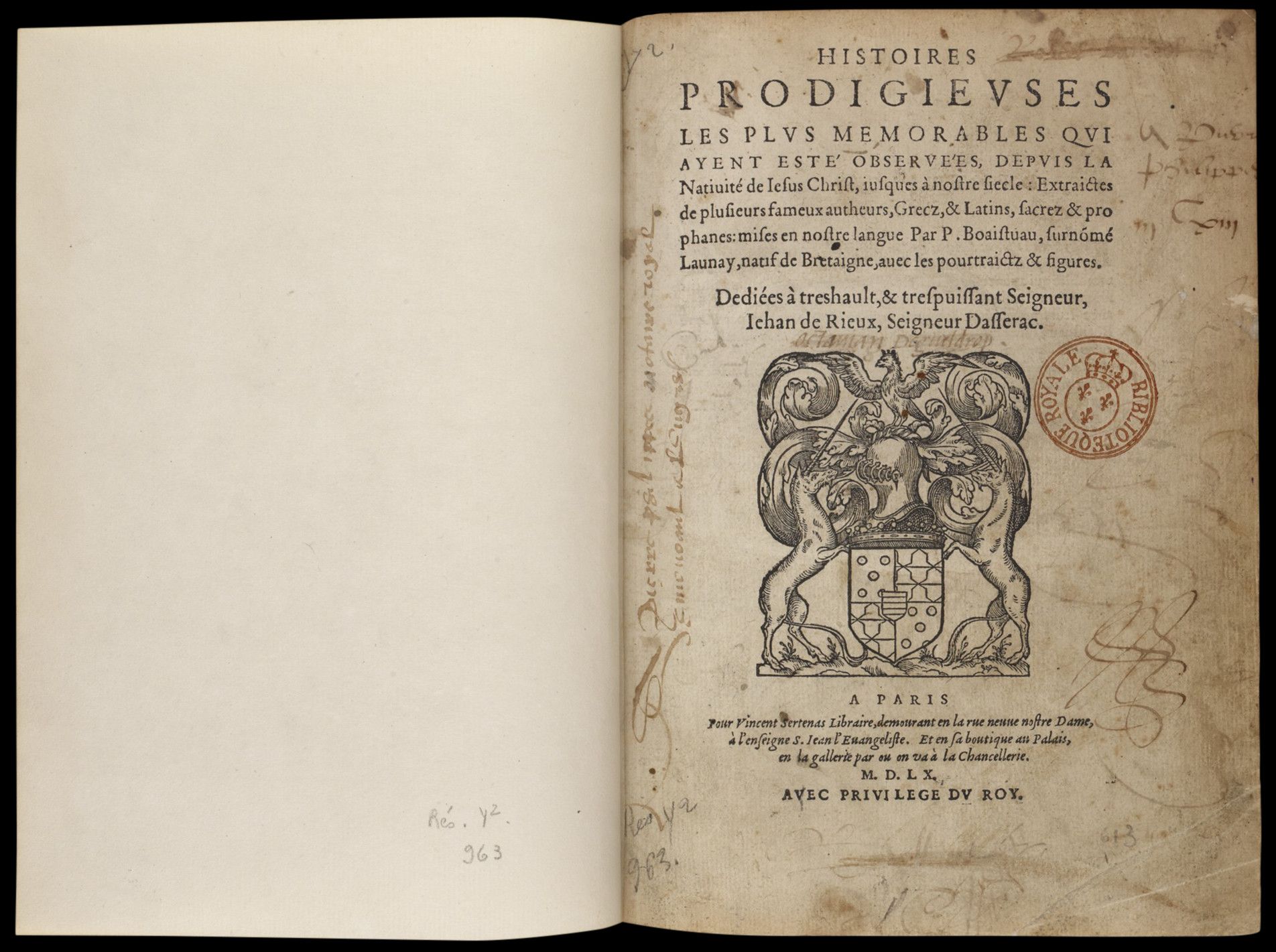
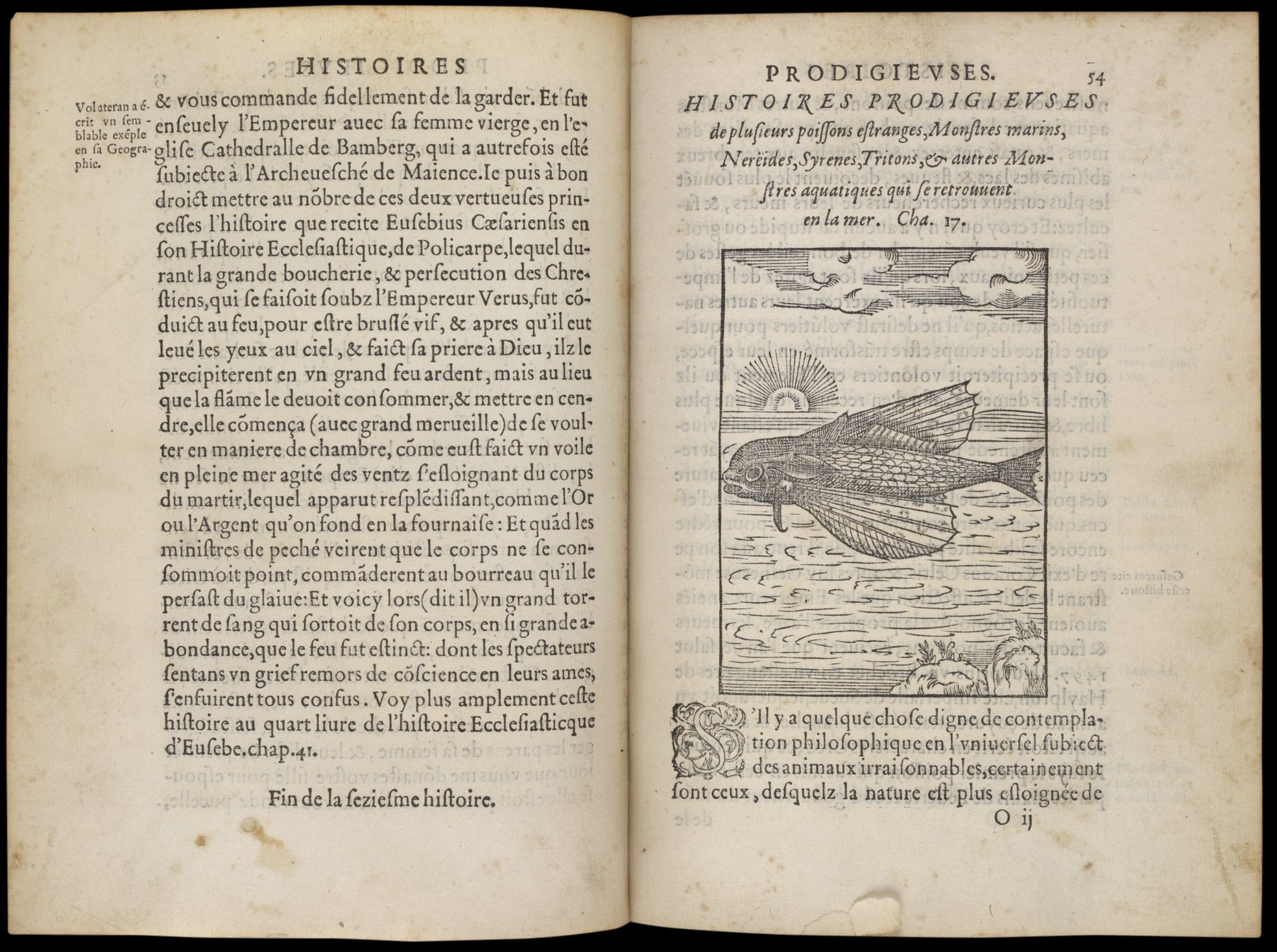
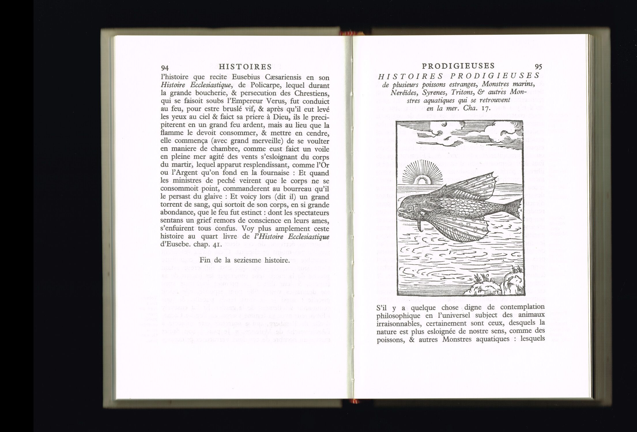
Some Clubs even offered particularly faithful reissues of old volumes. This is the case with Histoires prodigieuses Pierre Boaistuau, Histoires prodigieuses [1560], Paris, Club Français du Livre, 1961 , designed by Jacques Daniel. Originally translated and compiled by Pierre Boaistuau in 1560, the work consists of forty-four tales describing monsters, plants and celestial bodies, true or made-up facts, with real and legendary animals.
The Club français du livre provided a reissue that remained faithful to the original collection: the layout (pagination, glosses, text composition, illustrations and so on) and spelling were preserved, with only the typography modernised to enhance readability. Histoires prodigieuses les plus mémorables qui ayent esté observées depuis la nativité de Jésus-Christ jusques à nostre siècle : extraictes de plusieurs fameux autheurs grecz et latins, sacrez et prophanes / mises en nostre langue par P. Boaistuau…, Paris, Vincent Sertenas, Jean Longis, Robert Le Mangnier, 1560 https://gallica.bnf.fr/ark:/12148/btv1b86001672/f9.item
MLH
The decision to include such a book in the Club catalogue seems to reflect the publishers’ enthusiasm for such old works with their strange engravings. When viewed as a whole, these illustrations reveal recurring forms, styles, and themes. Rough lines, geometric representations, simplified hatching, characters with exaggerated expressions and surprising compositions. Together, they create an iconography that feels like a familiar refrain.
Beyond the images, whose raw charm likely captivated the Clubs’ book designers, I imagine there was a broader admiration for the graphic and typographic qualities of these old editions (text composition, humanist typefaces, initial letters and so on).
As seen in Histoires prodigieuses, there is sometimes a genuine desire to honour the historical legacy of the object. Conversely, in other titles, the chronology of the images can be completely flattened, almost erased, delving the different temporalities into thick fog…
ZL
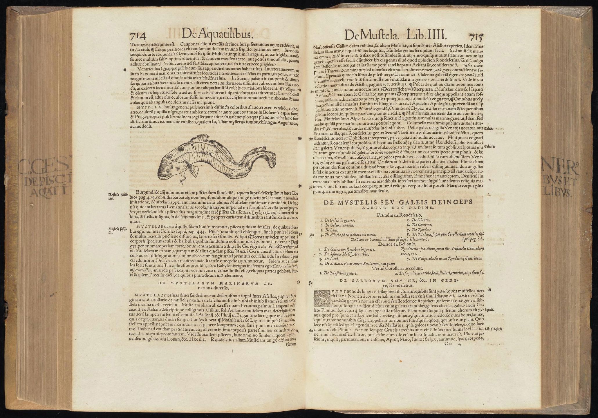
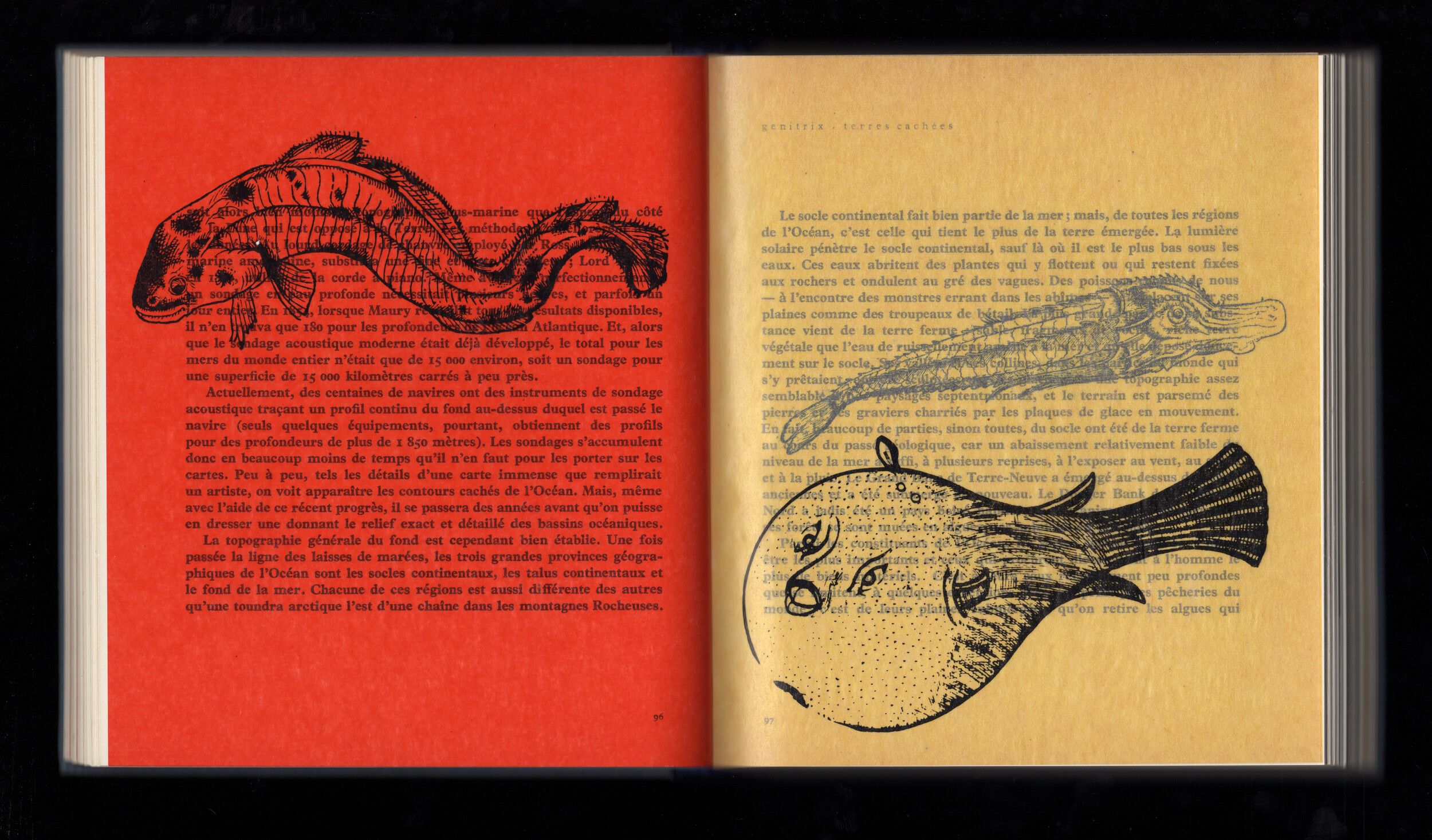
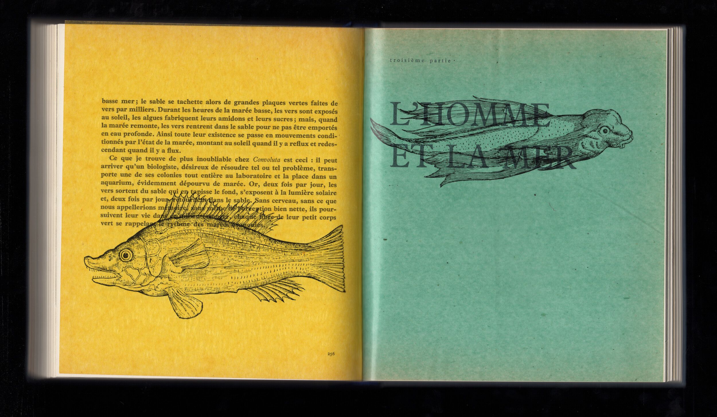
…which sometimes comes with a muddle of styles and techniques. This is what I sense when exploring Cette mer qui nous entoure Rachel L. Carson, Cette mer qui nous entoure [1951], Paris, Club Français du Livre, 1957 by Rachel L. Carson, designed by Jeanine Fricker in 1954.
In this poetic edition of popular science, the book designer juxtaposed ancient engravings with black-and-white photographs. Most of the prints come from Historia Animalium (1558) Conrad Gesner, Historiæ Animalium, livre IV, 1604 https://books.google.fr/books?id=JapKYg_dOloC&newbks=1&newbks_redir=0&printsec=frontcover&hl=fr&redir_esc=y#v=onepage&q&f=false , which can be considered as the first zoological encyclopaedia of the Renaissance, compiled by Conrad Gesner, a Swiss doctor and naturalist.
MLH
The example you mentioned is interesting because here, the engravings sport an entirely new materiality, and thus a new existence. Printing such images on coloured crystal paper gives rise to layers of intersection and superimposition. The different engravings engage in dialogue with the text and photographs, disrupting their reading and intertwining to form hybrid creatures.
They hold a central place in the book, influencing its comprehension. It is surprising that they are not credited (unlike the black-and-white photographs that also feature in the book). I wonder if this was Jeanine Fricker’s intention, perhaps aiming to obscure the different time frames?
ZL
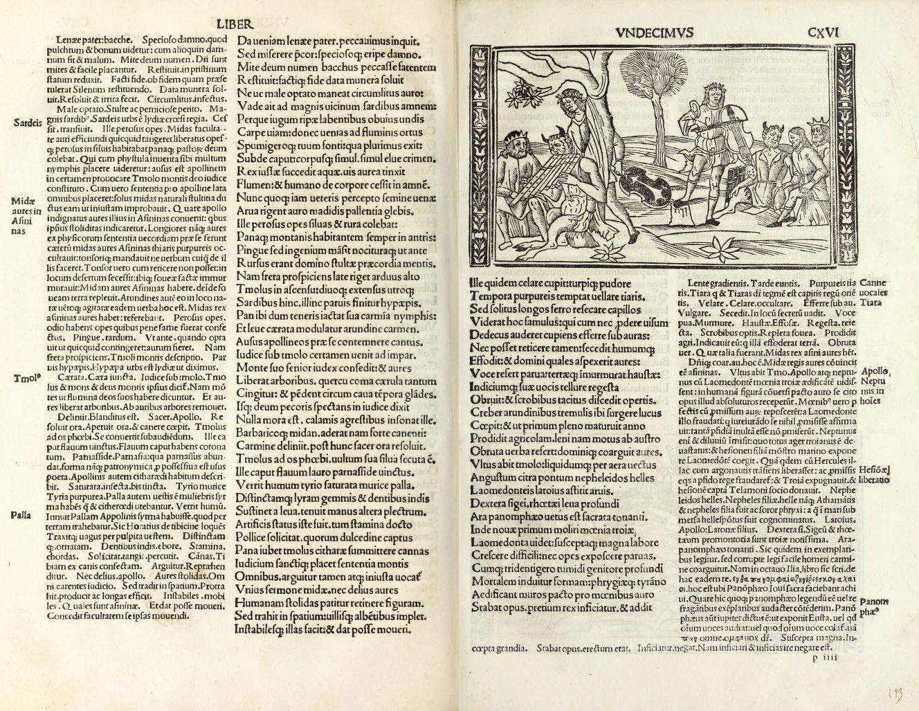
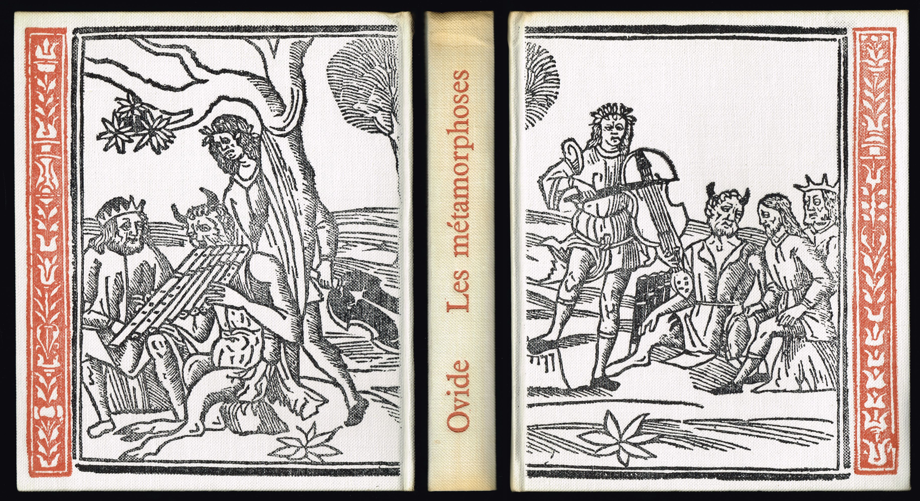
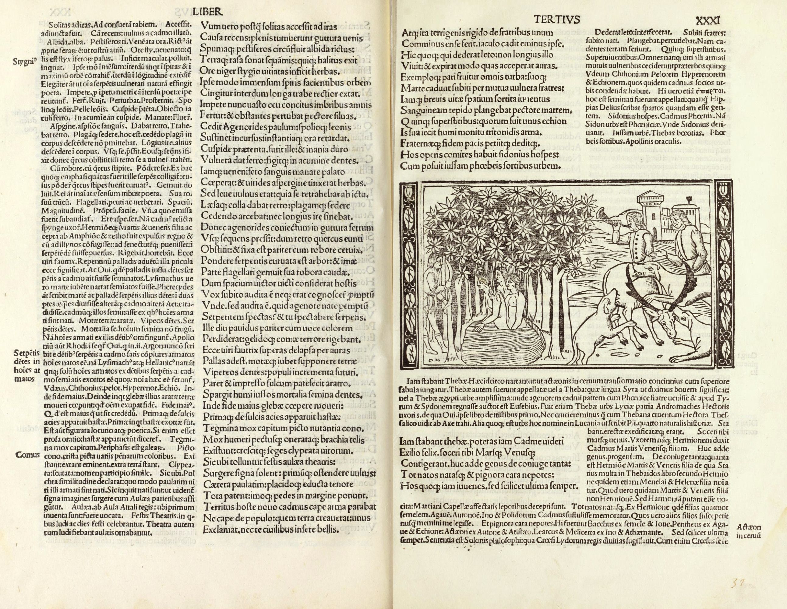
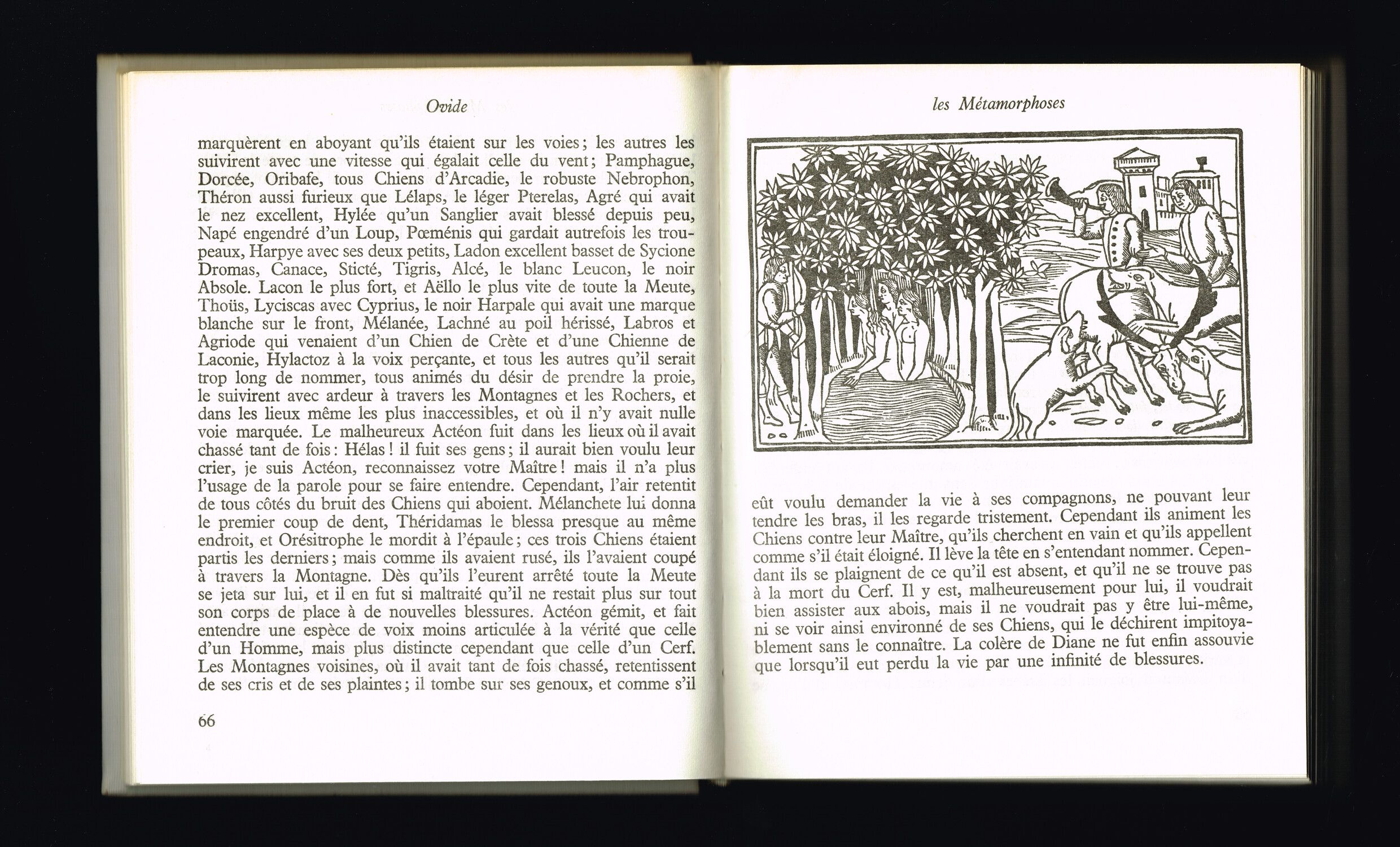
Yes, quite possibly. In fact, all of the engravings that have caught our attention from the start are rarely credited, and when they occasionally are, the reference remains vague. In Ovid’s Metamorphoses Ovide, Les métamorphoses [Ier siècle], Paris, Club Français du Livre, 1960. , the title page reads “illustrated with 16th-century woodcuts”. One must dig deeper to uncover the 1501 Italian edition Ovide, Metamorphoseos vulgare, Venise, C. de Pensa, 1517. https://gallica.bnf.fr/ark:/12148/bpt6k71107b/f50 from which Jacques Daniel sourced the illustrations.
But returning to Jeanine Fricker, she seems to be one of the few designers who regularly worked with an iconographer, Dominique Raoul Duval, whose name appears in several colophons. Their images always come from the Bibliothèque Nationale de France.
MLH
She must have worked there, since she can be seen in Alain Resnais’ film Toute la mémoire du monde Alain Resnais, Toute la mémoire du monde (35 mm – 21 mn), Paris, Les Films de la Pléiade, 1956. , wandering through the labyrinthine shelves that give the library its special charm.
ZL
Libraries, in fact, play a crucial role in our investigation. While their maze-like aisles initially appear as repositories of the written word, they also play a fundamental role in preserving images. These spaces of memory are the rallying points for iconographers; a practise that became professional in the 1960s “The early 1960s seem to mark a turning point for an activity which, although it had previously existed in different forms, started to emerge as a profession in its own right, with its own rules, discourse, specific demands. […] While Ostier, Bouvier and Ségalat certainly didn’t invent the iconographer’s role, they contributed to transforming it into a profession different from the broader field of documentation, establishing it as a unique skill and a creative endeavour that could be recomposed as such.” in Olivier Lugon, Nicolas Bouvier, iconographe, Infolio, Bibliothèque de Genève, Gollion, Genève, 2019, p. 29. . The Bibliothèque Nationale de France, with its department of prints, became the nerve centre for image research.
The renowned iconographer Nicolas Bouvier claimed to have spent countless hours in such places, which he viewed as a vast archipelago of images. I found a singular description he had made of his profession: “An iconographer is someone who seeks out the images requested by a varied clientele – scholars, publishers, magazine editors, graphic designers, jokers – and, in doing so, stumbles upon others that are even more beautiful and amusing, though no one asked for them.” Nicolas Bouvier, « D’images et d’eau fraîche », Radio (TV) Je vois tout, n° 38, 18 septembre 1975, p. 62
Bouvier wrote extensively about this profession, which he helped bring to prominence, and his reflections shed light on the dual practise of image investigator and duplicator. In the book Nicolas Bouvier, iconographe Olivier Lugon, Nicolas Bouvier, iconographe, Infolio, Bibliothèque de Genève, Gollion, Genève, 2019 , I read that his favourite visual forms were illustrations taken from manuscripts, scientific books, botanical and alchemical treatises and playing cards. Olivier Lugon, Nicolas Bouvier, iconographe, Infolio, Bibliothèque de Genève, Gollion, Genève, 2019, p. 121 . This iconography closely resembles what we found in Club books and I think it would be interesting to understand Nicolas Bouvier’s relationship with this ancient, popular material. For him, these images are “flashes of past-present” and he claimed to become indifferent to their chronology. In the Radio (TV) Je vois tout (n° 38, 18 September 1975) magazine, he wrote that “without being hostile to current art, he [the iconographer] becomes insensitive to chronology” (article « D’images et d’eau fraîche », p. 62) and now considers that “linear time has been abolished” (article « Le psaume du documentaliste », p. 63). .
Could it be then that the ancient, naïvely-drawn engravings appeared to Massin, Faucheux, Darche or Fricker as temporally fluid – blurring their historical contours and turning them into thoroughly contemporary images?
MLH
Indeed, as these images pass through their hands and under their gaze, they can slide from one space-time to another. Their history grows richer with new layers of meaning, readings and interpretation.
In this regard, I see a profound connection between the work of book designers and that of iconographers. In the case of Club books, designers bear significant responsibility for enriching the critical dimension of the main narrative. Beyond (typo)graphic layout, there is a genuine intent to contextualise and comment on the literary text, particularly through the addition of external material. Embracing the idea that surprise can emerge from a document from the past, designers embark on a meticulous task of iconographic exploration. The images they select, adapt and paradoxically treat as “unpublished” allow them to shape the books entrusted to them.
ZL
French iconographer Jacques Ostier goes even further, by standing as “co-author-creator” of the works he contributed to. For him, the research for images isn’t solely an act of execution, but involves a deeply subjective interpretation of the text. He wrote “Consequently, the documentalist bears a serious responsibility and plays a key role in the architecture of the book. […] He thus becomes a director who has to stage the images as if they were a real film. […] True to the author’s thinking and style, they recreate a similar work in images, with the two works integrating closely with each other and reinforcing each other. Illustration is no longer an addition, it has become a creative force”. (Dans Olivier Lugon, Nicolas Bouvier, iconographe, Infolio, Bibliothèque de Genève, Gollion, Genève, 2019, pp. 30,31)
MLH
For the designers of Club books, the role of researcher is coupled with that of creator. Via chromatic transformations, cropping, stylistic simplifications, scale effects and other graphic tricks, they become “image-makers” in their own right.
Their multifaceted interventions visibly shape the path of the editorial object and, in my opinion, truly resemble a process of writing.
As such, it is common to draw parallels between the practice of graphic designers and that of translators. In Latin, to translate (traducere) means “to carry across” and the German equivalent (übersetzen) indicates “transporting beyond”, or “moving further”. Like the designer’s act, the translator’s task consists in relocating existing content into an entirely new form.
Images take part in this displacement. On the one hand, they improve the text and influence how readers engage with it; on the other, they stand as genuine tools of writing, wielded by designers to tell fresh stories. Just as a text can be turned into something to be seen, the image here becomes something to be read. Two narratives meet, told through two distinct languages.
Adorning the pages of Club books, the visual paratext extends the narrative, giving readers the chance to experience it from an entirely new angle. While this iconographic addition plays a key role in the reading of the reissued text, it is equally relevant to consider its less-discussed reciprocal: how does the meaning of images evolve when paired with textual content? Does the text also significantly influence how we read them?
ZL
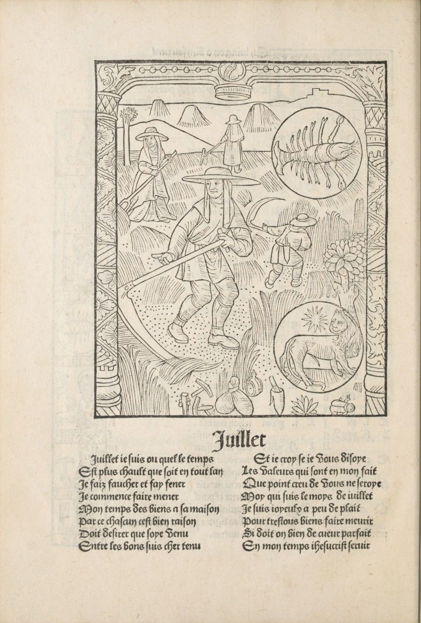
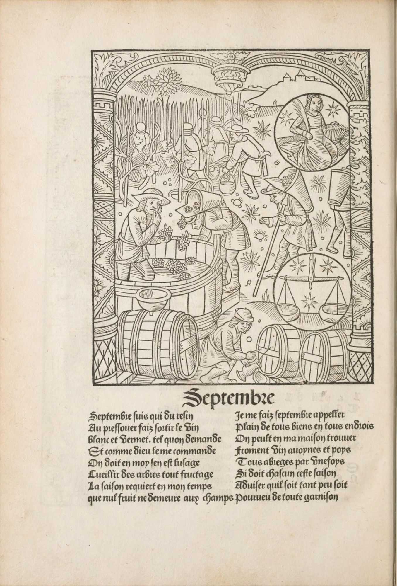
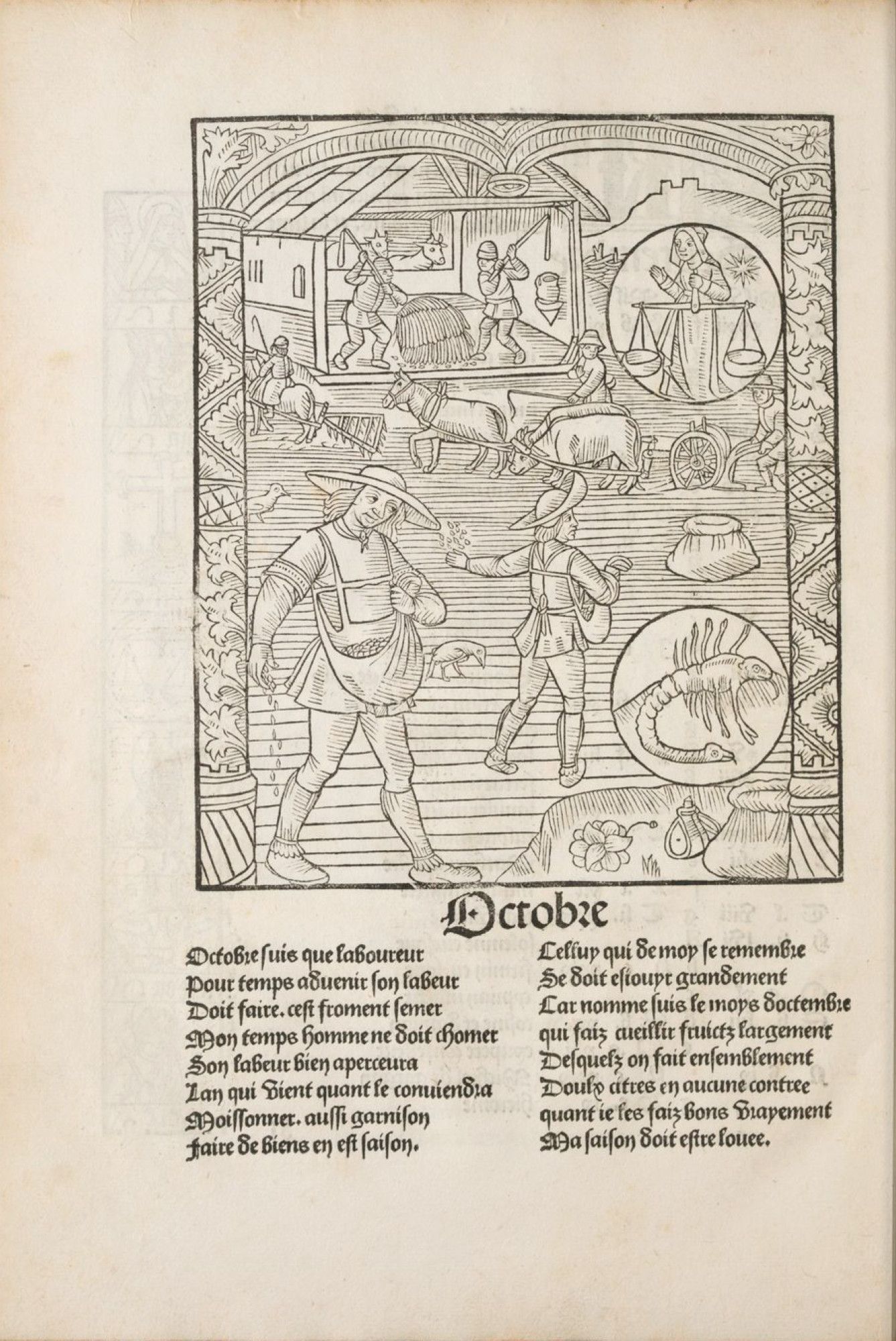
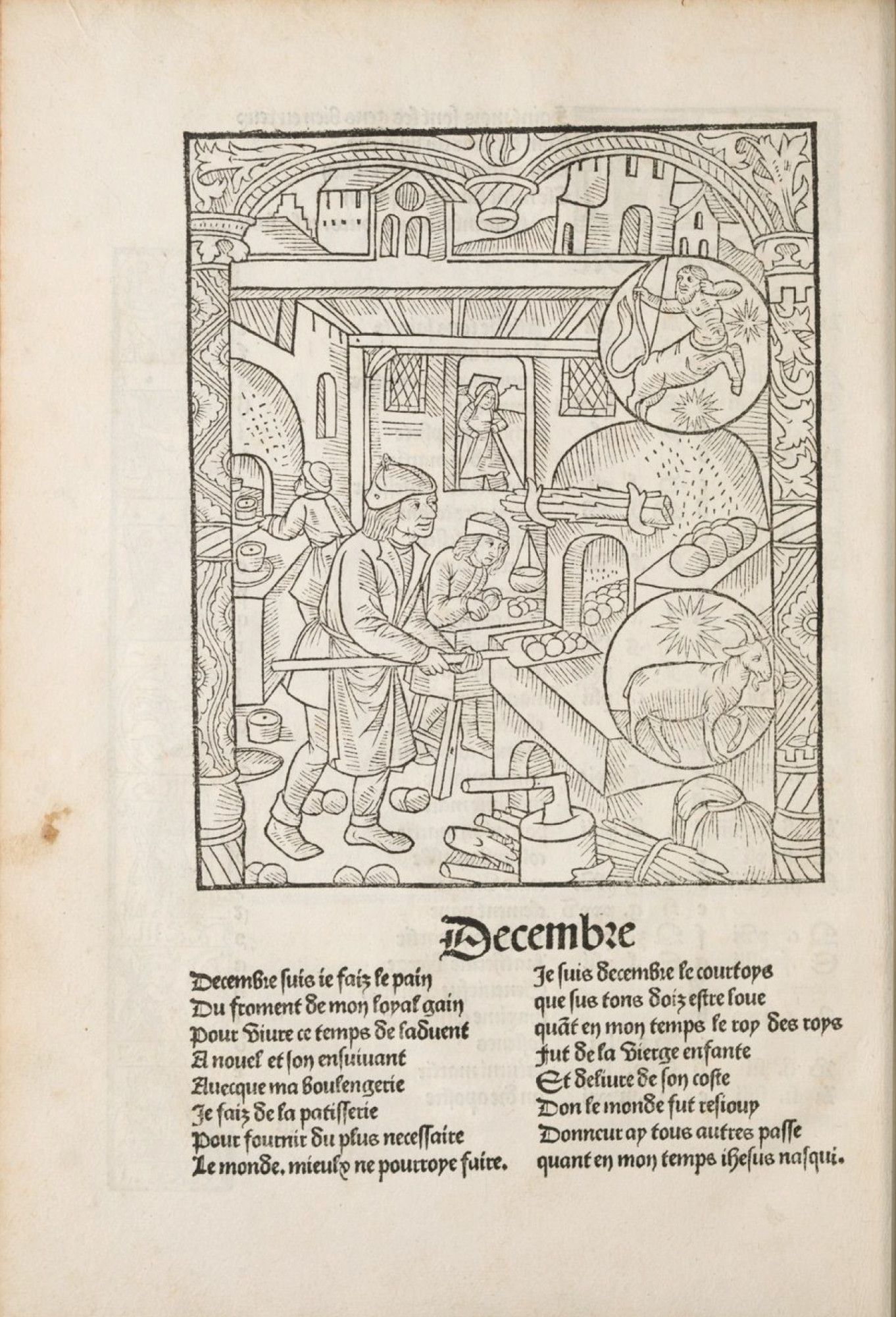
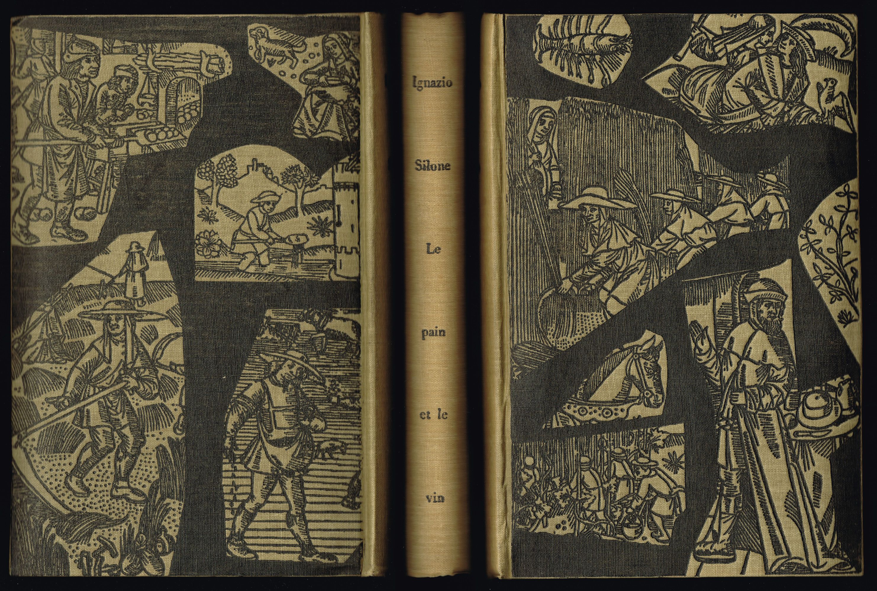
To do so, let’s take Ignazio Silone’s novel Le pain et le vin Ignazio Silone, Le pain et le vin [1939], Paris, Club Français du Livre, 1950 from the shelf, designed by Pierre Faucheux in 1950. The front and back cover pages display fragments of engravings taken from a Calendrier des bergers Le Kalendrier des bergiers is an almanach printed for the first time in 1491 by Guy Marchant, a French priest-printer. Several versions then saw the day, such as Compost and Kalendrier des bergeres, printed in 1499 and preserved at the BNF. . This small, practical, and moral guide was filled with images: zodiac signs, anatomical boards, danse macabre scenes, and depictions of farming and craft activities, all intended to guide men and women toward salvation Calendrier des bergeres, Paris, Guy Marchand, 1499 https://gallica.bnf.fr/ark:/12148/bpt6k8712156x/f50 .
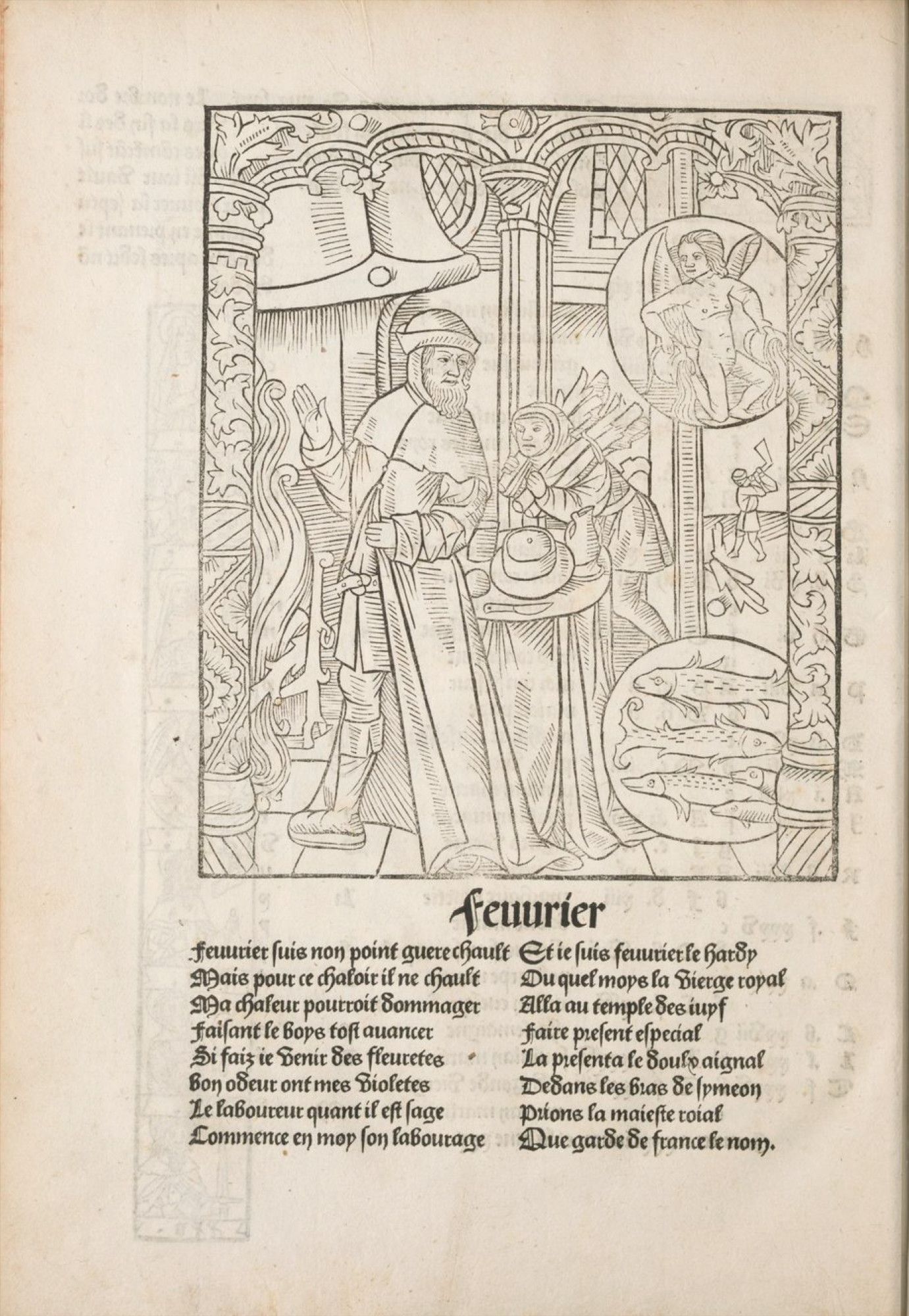
MLH
In the early 17th century, the Calendrier des bergers became a part of the Bibliothèque Bleue, a collection largely printed in Troyes and distributed by travelling salesmen.
Beneath the blue-grey paper that gave the collection its name, one finds fragile, hastily-bound pages, blackened with chivalric novels, pious texts, books of hours, and also “practical” content such as almanacs and primers.
To illustrate these writings, Troyes publishers acquired old, worn, and outdated woodcuts, which they endlessly reused, recut and reprinted.
It is fascinating to observe the dual movement of these popular images. A movement that is both spatial (since distributed by itinerant salespersons) and temporal (since they circulated through books and across eras), layering their stories with rich semantic depth.
ZL
Indeed, these images have spanned over several centuries, experienced multiple editorial adventures, and been seen by countless eyes before finding their way onto the pages of Club books.
For Silone’s novel, Pierre Faucheux selected images from a Calendrier des bergers depicting craftsmen and peasants busy at work. They introduce the story of a young Italian communist activist returning from exile during Mussolini’s dictatorship. Forced into hiding, he disguises himself as a priest in a remote corner of the Abruzzo region. Written in 1937, the novel bears witness to this dark period, enriched by the author’s own experience as a communist leader living clandestinely under the fascist regime. How can images from the late 15th century be read centuries later in this social-political context?
MLH
The images adorning the entire cover are visually and semantically dense, and Pierre Faucheux’ position may give rise to multiple interpretations. Could the dark colour evoke the Blackshirts of Mussolini’s government? Do the assembled images of workers and peasants symbolise the unity of labour forces advocated by the Italian Communist Party? Is the Battle for Grain The Battle for grain was a propaganda campaign launched by Roberto Mussolini in 1925, with the aim of gaining self-sufficiency in wheat production for Italy. being denounced in the woodcut engravings of labouring men and women on the back cover? And do these fragmented images incriminate the division of the population under the dictatorial regime?
At the same time, we know that Ignazio Silone renewed with his Christian roots in the early 1950s. The Calendriers des Bergers was designed to popularise religion and strengthen the faith of its readers. Perhaps, through this iconographic selection, Faucheux also sought to illustrate the newly rekindled bond between Ignazio Silone and his spirituality?
ZL
The cover of this novel also highlights the phenomenon of image circulation within the Clubs. The sower glimpsed at the bottom of the back cover is also the main character of Jean Giono’s Regain Jean Giono, Regain [1930], Paris, Club Français du Livre, 1960 in the Club du Meilleur Livre version designed by Jeanine Fricker in 1960. This time, the figure, completely isolated from its pastoral surroundings, takes up the entire front cover.
MLH
We see, then, how a single engraving can be used by different designers, in different books, from different Clubs. These iterations shed light on the very nature of prints: endlessly replicable.
If we take the time to explore the Bibliothèque Bleue catalogue, we again find images repeated, reused from one book to another, sometimes even printed multiple times in the same booklet.
ZL
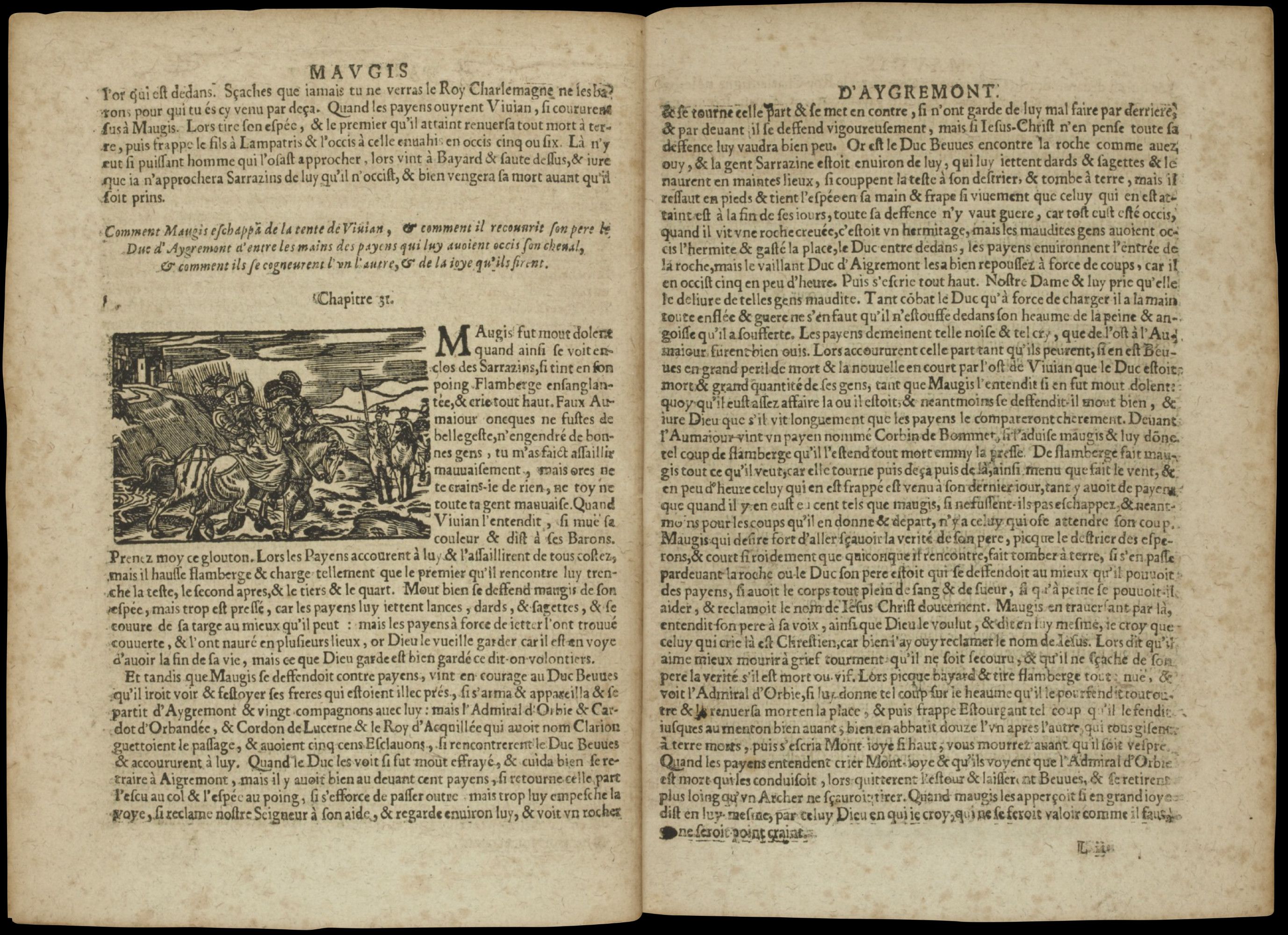
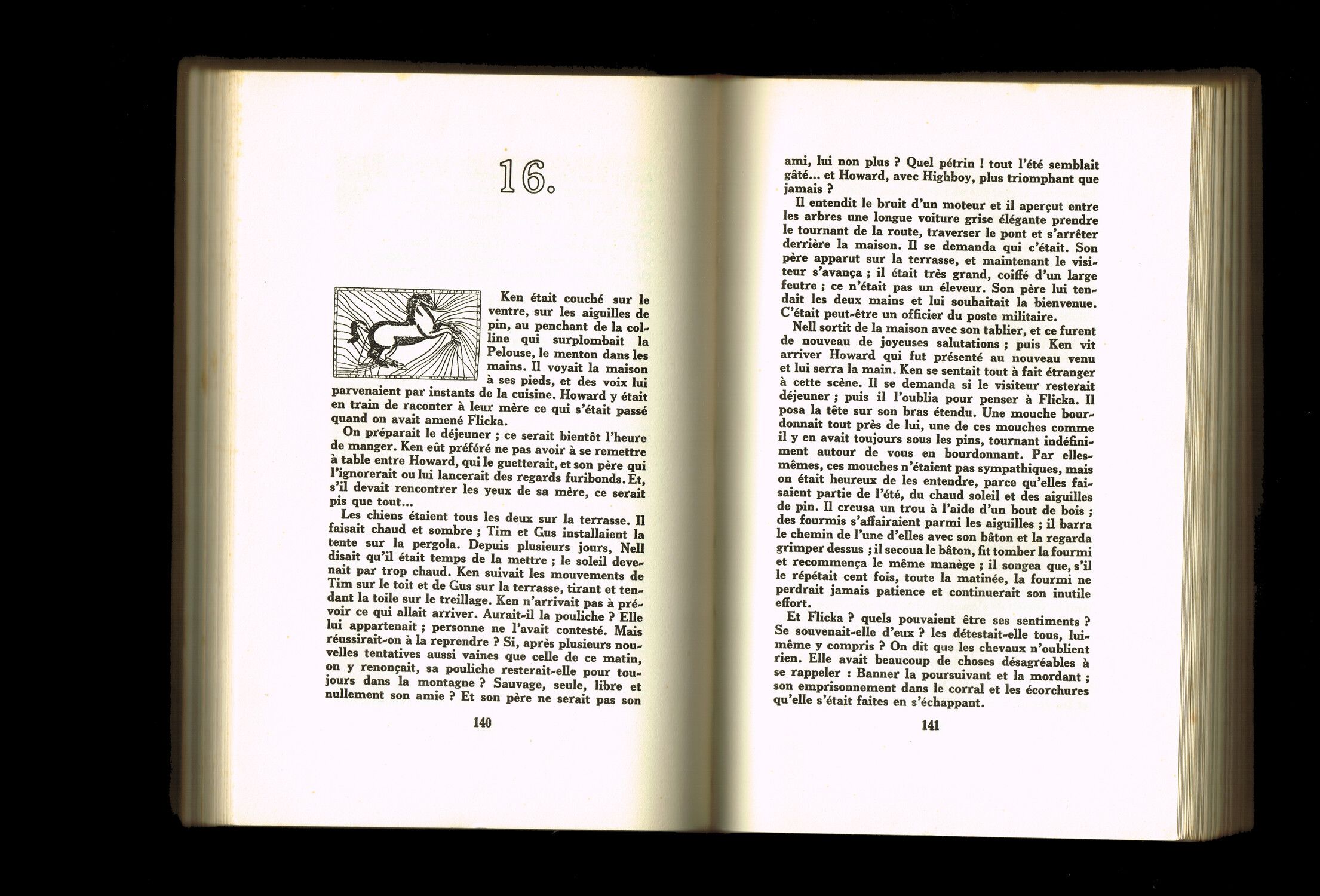
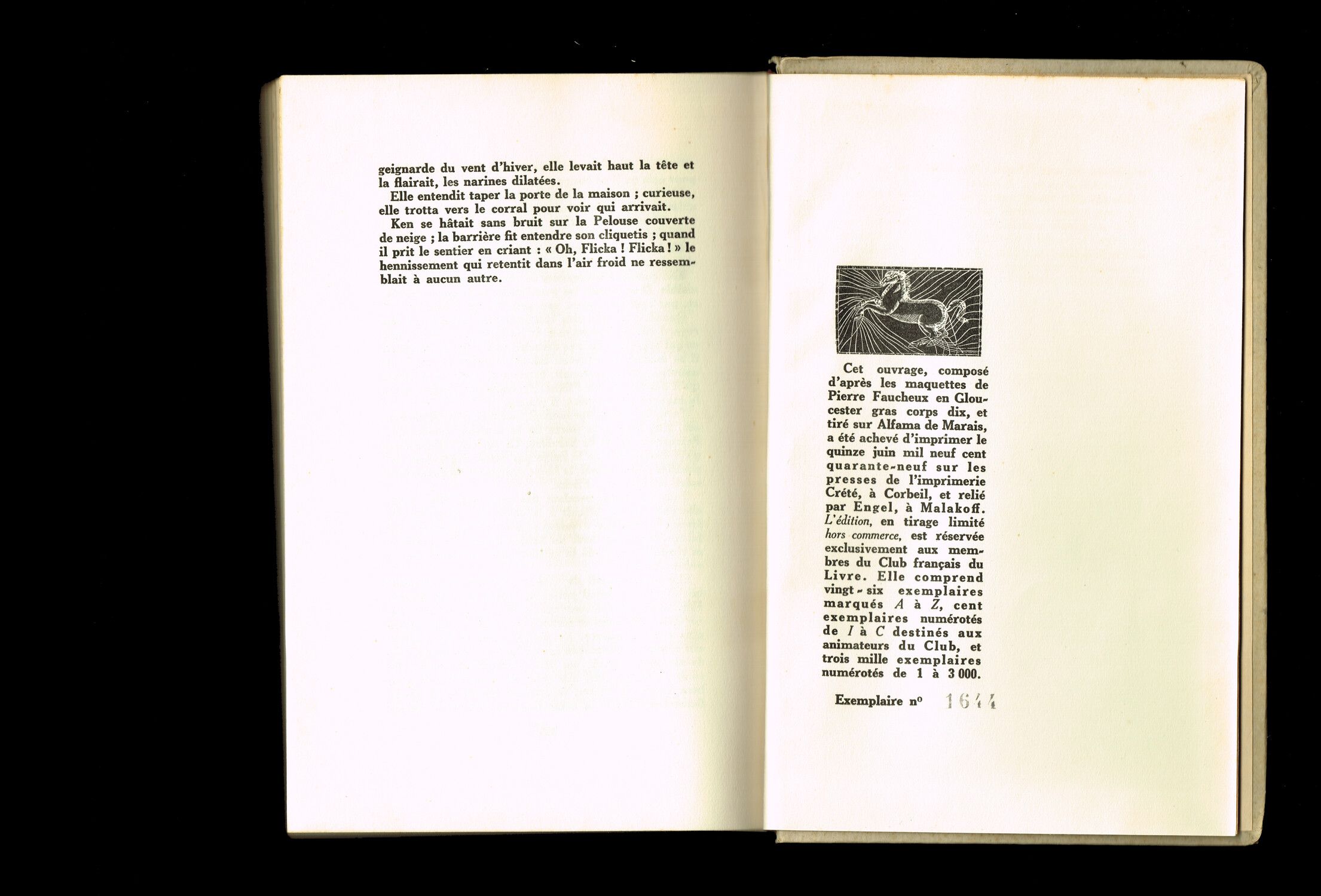
Centuries later, Pierre Faucheux revisited this process in Mon amie Flicka[^35]: the same horse gallops across the cover page, wanders through the pages and ends its run in the colophon. With each appearance, its size and coat colour shift, until the end of the book where it is printed in negative.
MLH
True to form, this image also originates from the Bibliothèque Bleue, itself sourced from a 17th-century practical guide This horse can be found in one of the many copies of Maréchal Expert published by the Bibliothèque Bleue at the end of the 17th and early 18th century, but the engraving, older, must have already adorned the pages of some educational books of the 16th century. In L’Agriculture et la maison rustique (1586) for example, a similar looking horse can be found: , which here became a playground for graphic experimentation.
ZL
That’s true and I feel as though we are going round in circles, much like these images that seem to follow a cyclical path, never escaping the confines of books and tracing a closed loop of iconography.
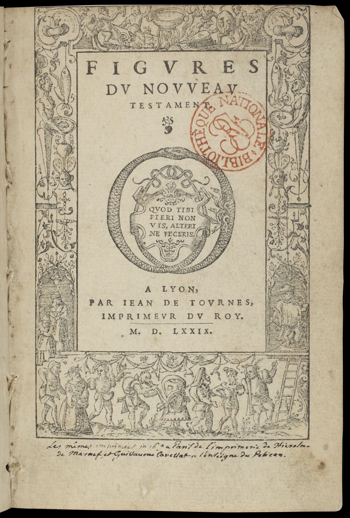
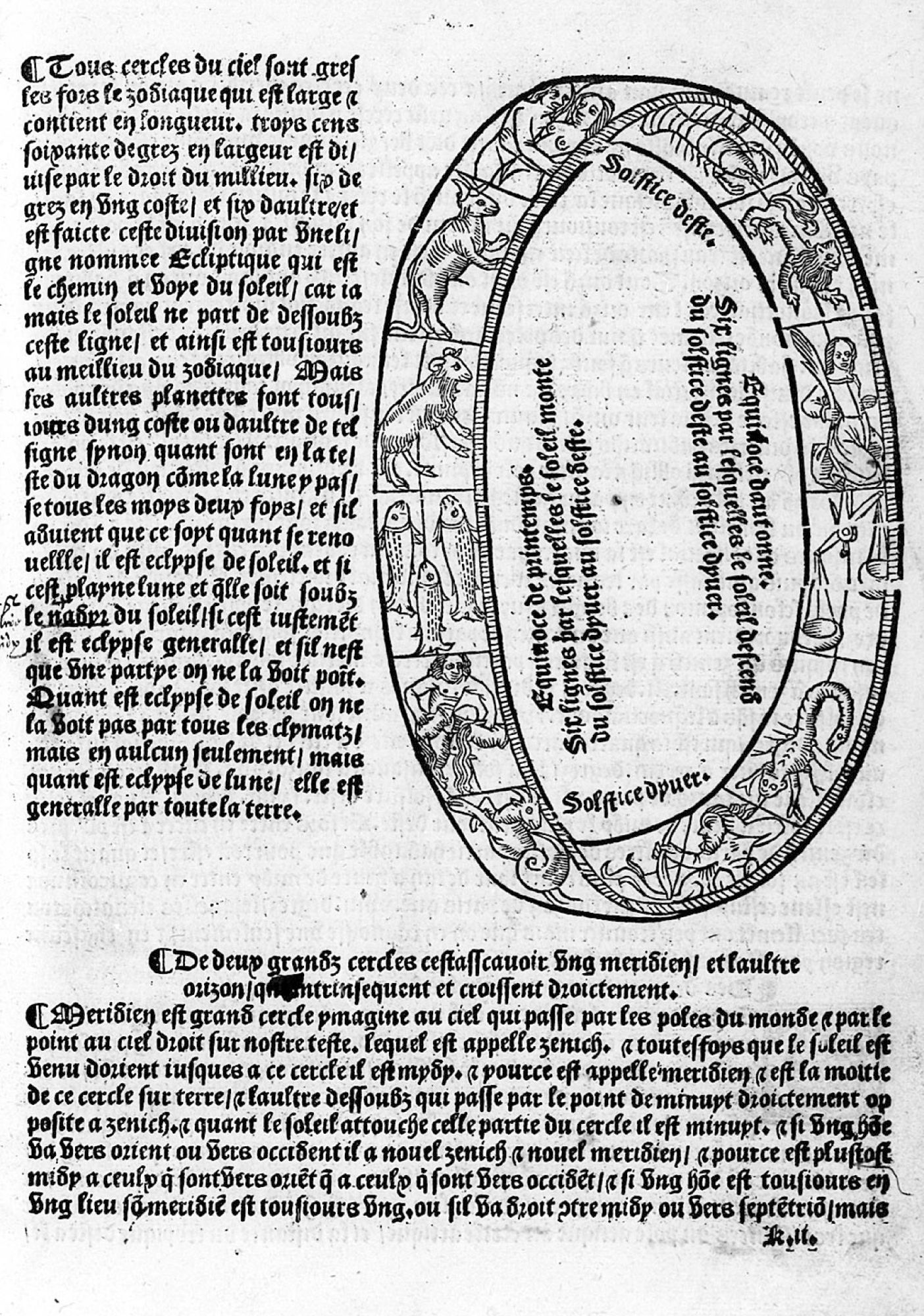
This notion of the cycle is, in fact, literally embedded in the chosen engravings. Pierre Faucheux crowned the cover of Ronsard’s Œuvres choisies Pierre de Ronsard, Œuvres choisies [1841], Paris, Club Français du Livre, 1948. with an imposing ouroboros, used by Jean de Tournes (16th-century printer from Lyon) as a typographic mark This typographic mark appears in Charles Fontaine, Figures du Nouveau Testament, Lyon, Jean de Tournes, 1579. https://gallica.bnf.fr/ark:/12148/btv1b86095410/f5.item.r=Jean%20de%20Tournes . Alain Le Breton covered Marco Polo’s Le Devisement du monde Albert t’Serstevens, Le livre de Marco Polo ou Le Devisement du monde [1298], Club Français du Livre, 1953 with a volvelle, a calculating instrument used to determine astronomical cycles We have not been able to trace the exact origin of the volvelle featured on the cover of this book, but it must surely come from a 16th-century edition. Indeed, a similar engraving can be found in different editions of Sebastian Münster’s Cosmographie Universelle: https://gallica.bnf.fr/ark:/12148/btv1b53247488t/f88.item.r=Cosmographie%20universelle%20munster . As for Jeanine Fricker, she enveloped the blue cover of Le Mas Théotime Henri Bosco, Le Mas Théotime [1945], Paris, Club Français du Livre, 1957. with the twelve astrological figures from a Calendrier des bergers Compost et kalendrier des bergiers…, Paris, Guiot Marchant, 1496. .
MLH
Let’s not forget the moons and suns, quintessential cyclical symbols, which adorn Club books by the dozen, from interior pages to bookbinding cloths. Take, for example, the cover of Enfants du bon Dieu Antoine Blondin, Les Enfants du bon Dieu [1952], Paris, Club du Meilleur Livre, 1953. , which boasts the laughing face of the sun – the same sun that, in 1948, already illuminated Les Aventures du roi Pausole, the very image that sparked our investigation.