Looking good, doing well
2025, I had just spent an hour analysing the composition systems imagined by book designer Pierre Faucheux in the text blocks of three volumes of La Bible, published by the Club français du livre in 1964. Faced with the extensive content and diverse textual registers, he used a variety of typographic techniques to ensure fluid reading and navigation through the books.
Having worked as a graphic designer for two years, I am currently collaborating with two experienced designers on the design of a complex exhibition catalogue. In this process, our discussions, as well as the quieter exchanges I have with the objects designed by Faucheux – in this particular case – help shape my ideas. My small collection of Club books, enriched by the resources of the Club Collecte website, serves as a silent manual– my graphic designer’s ‘bible’, if I remain faithful to my chosen subjects of study.
I am not the type to worship anyone. What I am interested in isn’t so much the sacralisation of graphic design icons, but understanding how the objects I refer to were conceived and manufactured in concrete terms. So, let’s go back through history: Faucheux, who died in 1999, was the artistic director of the Club français du livre from 1946. He left this position in 1951, joined the Club des libraires de France in 1954, and then founded his own studio in 1963. He went on to collaborate with numerous publishers until the late 1980s. Among those who worked under his guidance was Robert Massin, trained at the Club français du livre, who became artistic director of the Club du meilleur livre in 1952, and later joined Gallimard in 1958. He passed away in 2020.
How to go further? Back to Club Collecte, the resource I rely on. I know that Etienne Robial Etienne Robial doesn’t accentuate capitals. As such, his first name will not be accentuated in this text. owns practically all the archived collection. A graphic designer and former bookseller, he co-founded Futuropolis with Florence Cestax (1972-1986), which he later sold to Gallimard. His extensive experience of the publishing world, especially at Gallimard where his path crossed with Massin’s, makes me eager to meet him.
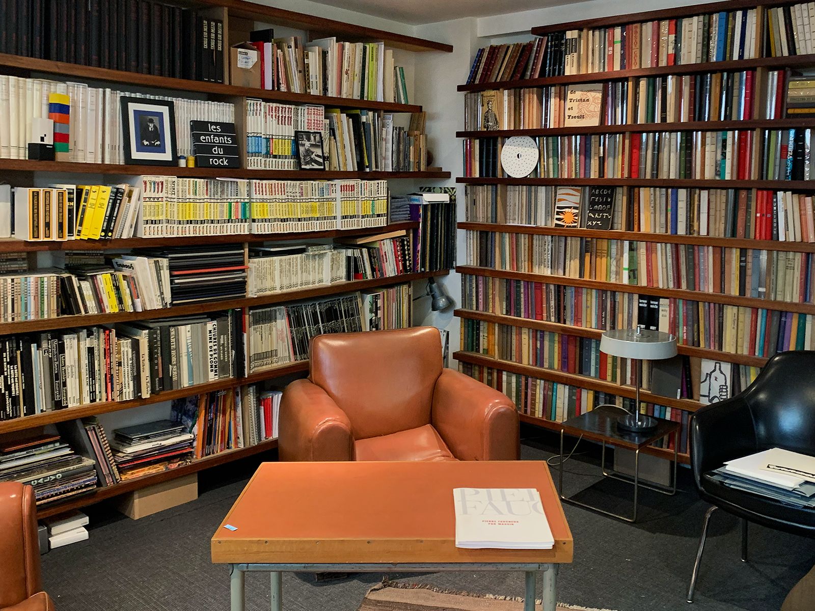
I write to him. We speak on the telephone, and arrange to meet. A few weeks later, he welcomes me in his studio in Paris. We settle in the back room, blinds drawn, the ceiling light on. I sink into a large armchair, Robial sits opposite. The wall to my left is lined with Club editions, the one to my right mostly Futuropolis titles. The space is dense, alive, saturated with books. Robial opens the conversation:
— My collector’s side – that’s another story. With the Club books, my ambition has been more about making them known and sharing them rather than analysing my pathology – which is, admittedly, a pathology.
It was actually through this lens (his collection) that I found my way to him. But here, it’s less about accumulation and more about discussing books, their making, their circulation. Together, we look at the wall of Club editions. He points to a corner:
— Up there on the left, those are Les Portiques Les Portiques Collection, edited and published by the Club français du livre from 1948 to 1979. , printed on Bible paper. They came after La Pléiade La Pléiade Collection, edited and published by Gallimard. The first volume was published in 1923. , also on Bible paper.
As he mentions one of the Club’s reference works, he pulls out two copies of Victor Hugo’s Notre-Dame de Paris, a classic of French literature. I hold them and compare them: inside, the text blocks are similar, outside, the covers differ – one is cloth, the other is leather. Robial tells me:
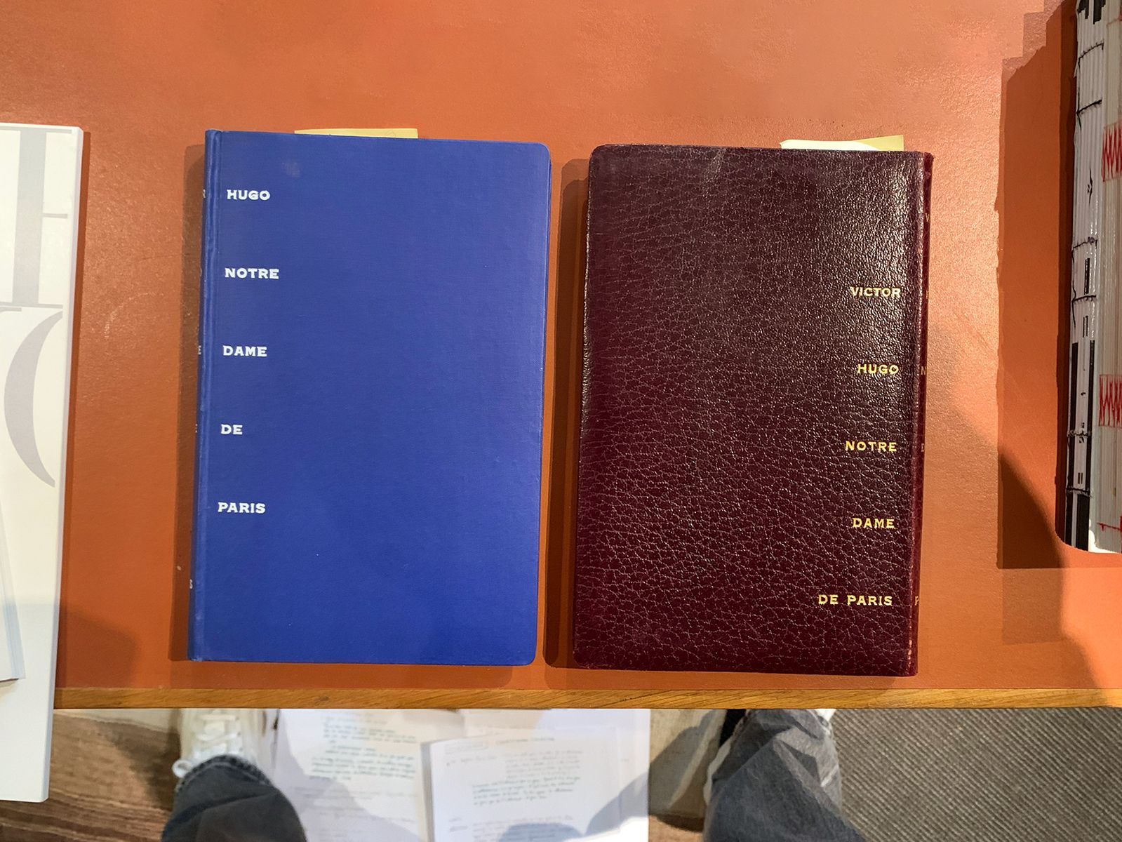
— When it’s leather, you add a bit of polish to make it shine. People would put these in their libraries, to ‘look good’.
That phrase sticks with me ‘to look good’. It unsettles me slightly. In the case of the Club books, Robial highlights how a book can become an object to display, something to show off at home, a kind of symbol of knowledge or even of social status. A way to ‘look good’, precisely.
— We need to set the record straight. This isn’t true bibliophilia. It’s petite bibliophilie – wannabe bibliophiles trying to pass themselves off as the real thing. Club subscribers are easy marks who think it’s bibliophilia just because the books are numbered and ‘limited edition’, when in fact a Club print is far larger than an original edition. I don’t have a specific title in mind – we could check at the BnF Under the legal deposit system, the Bibliothèque Nationale de France, located in Paris, receives documents of all natures edited, imported or distributed in France. Established in 1537 by François Ist, legal deposits are governed by the French Heritage Code. – but for example, a book published by Gallimard in the nrf collection, may have a print run of two thousand two hundred copies, while a Club edition would be ten thousand ‘limited to…’ copies This appeared on the colophon page of books, with the name of the book designer, the typographic character, the quality of paper, the printer, the binder, the date of publishing, the number of copies printed and the numbering, cf. scans at clubcollecte.fr. .
Robial’s blunt tone drives home a key point: the idea of rarity is a construct that readers may have bought into, sometimes unconsciously, seduced by the bibliophilic codes embedded in the design. The books look the part, but they lack the actual rarity.
As the conversation unfolds, Robial pulls Pierre Faucheux par Massin Robert Massin, Pierre Faucheux par Massin, prefaced by Etienne Robial, Paris, self-published, 2007. from the bookshelf to my right. A self-published book by Massin, for which Robial wrote the preface and in which he refers to the two as “French ‘monsters’ of page layout”. Noticing the overlaps in his anecdotes, I ask him if he started collecting Club books because of Faucheux and Massin.

— No, it wasn’t deliberate either. Faucheux wasn’t as well-known then as he is today. I am a scavenger at heart. You stumble across these books – one, two, three, four, five, six… - all because of that ‘limited edition’ snag Despite large-scale production, clubs maintained the illusion of a rare item by numbering the books. However, Robial states that this numbering primarily fulfilled a contractual requirement with publishing houses—with the actual print run often being higher than the stated number. . I started making lists by year. The problem at first, when you don’t have a list, is you end up buying duplicates. I remember going to Cannes for Canal+ for the festival. Instead of attending the film premieres, I’d hit every bookshop in the area to find piles of Club books for one franc or one euro. Prices went from a franc to one euro (thanks, inflation). At that price, you don’t bother sorting through them. The only issue is transporting them. You ask the bookseller to send them to you. For that kind of money, who cares if you buy two, three, or four copies? You know that in the quest for the ‘best condition’, there’s always one that’s better than the others. And it builds up stock for gifts or trades.
The sheer number of titles published by the Clubs, combined with their massive distribution, means you can still find them easily and cheaply today. Often in good condition – either because some subscribers took care of them or because others never even read them.
In my opinion, what makes these books precious is the attention to every detail of their design, even within a framework of large-scale production and distribution. It’s in this tension, between staging the exceptional and making it accessible, that I find one of their greatest strengths. It’s an effect I also strive to create in my own work: making people want to open, read, and own a book. Not by artificially playing up external signs of value, but by genuinely caring about every detail: the structure, the rhythm, the typography, the materials. By doing it well, simply. Not to look good, but to do it well.
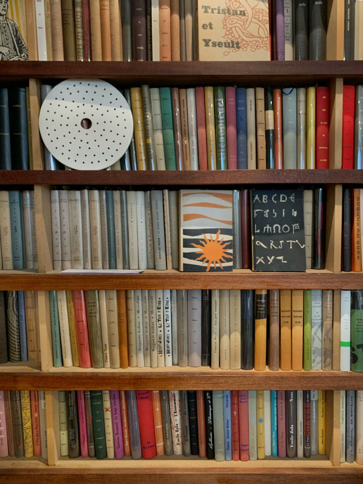
On the wall to my left, the shelves have been assembled to match the exact height of the volumes. I imagine the quiet satisfaction, from a collector’s perspective, of seeing those books perfectly aligned, forming a continuous, straight line. From a production standpoint, this reveals an editorial strategy: by standardising the format, a publisher considerably cuts printing and manufacturing costs – while giving the book designer a restricted, yet stimulating playground. It was within this productive limitation that variations emerged. The spines differ in colour, material, and thickness. Most of the time, they bear only the author’s name and the title – typeset according to principles specific to a collection, or occasionally with more creative freedom. This diversity doesn’t arise in spite of the format’s regularity, but because of it: it established a legible framework, a kind of shared visual language.
At the front of the shelf, Robial has placed a few books front cover facing up, interrupting the uniformity of the spines. He comments:
— These are bold choices that wouldn’t have been possible otherwise. They did it because it wasn’t done. Normally, a book is sold in a bookshop, where the cover’s whole purpose is to sell the copy.
He points to the ones displayed:
— You don’t design books with covers like these to sell them in bookshops. You wouldn’t sell any. For the Club books, they didn’t need to be attractive, since the postman dropped them straight into your letterbox.
I open a few, lingering longer on the endpapers than on the text pages.
— The endpaper is technically meant to bind the text block to the cover. But here, the book designers use it because it amuses them. That’s what makes it so unique, this playful, almost carefree approach: we have to fill the pages. Robert Carlier Robert Carlier, editor of the Club Français du Livre from 1946 to 1952, before working for the competition, the Club du Meilleur Livre. didn’t even see all of this. It was sent straight to the printer, who then forwarded it to the distribution office, which mailed it directly to subscribers.
The Club system relied on a unique commercial model: they bought the rights to already-published books from other publishers, forcing them to differentiate their editions from those already on the market. This need for distinction, combined with the fact that the books weren’t sold in bookshops but mailed directly to subscribers – as Robial explains to me – led book designers to think beyond commercial standards, allowing them to come up with more ‘original’ solutions. Across the six endpapers of these books, you find typographic experiments, combinations of characters, collages, prints, documentary images, transparencies… These aren’t just decorations, they guide the reader’s gaze. The book designer offers a singular graphic interpretation of the text, a visual reading that fully engages form with meaning.
This kind of intervention, made possible by the Club system, reveals a way of inhabiting the role of a book designer, more broadly, of someone who makes books: a stance that is both technical and sensitive, rigorous and deeply involved. That is also what Robial underlines, in his own way:
— We’re not talking about graphic designers here, we’re talking about maquettistes. ‘Graphic designer’ is a recent term. These maquettistes or book designers prepared the copy, did the real typesetting with tools, and worked directly with printers. Faucheux would go to the Savernoise printer’s in Alsace. In the book production chain, the printer delivers to the collator, who delivers to the binder. These are distinct trades. When you compare the work of a true artisan binder to that of an industrial binder, it’s a completely different league.
In the daily grind of production, these book designers strove never to overlook the technical precision of their craft and knowledge. Robial continues:
— It was work, not art. It was the job, you had to churn out a certain number just to make a living. Book designers were not well-paid, but paid per book. The production pace was intense. Faucheux would bring in his friends, who worked at other publishing houses – they did what we called ‘moonlighting’, which is why they used pseudonyms A non-exhaustive list of pseudonyms: Jean Norman, Félix Vermot, Leslie Grant, Jacques Brell (Massin), Henri Warnant (Jacques Daniel), Jean Padoue (Jacques Darche), Paul Gibelin (Jacques Darche and Massin) and Henri Huchot (Pierre Faucheux). Sources: Jean-Étienne Huret, Alban Cerisier, Le Club du Meilleur Livre (1952–1963), Librairie Jean-Étienne Huret, 2007 / Bernard Gheerbrant, Le Club des Libraires de France 1953–1966, IMEC éditions, 1997. .
When you look at the books themselves, something goes beyond simple execution. The graphic choices, formal inventions, and attention to detail, whether subtle or more emphatic, in the margins of the system, testify to a commitment to doing a good job, despite low pay and limited recognition. The work of a book designer was anything but a luxurious or detached practice.
Through the lens of the Club books, our conversation underlines a way of approaching the craft – one deeply rooted in the knowledge of materials, tools and the history of the book. The word ‘maquettiste’, which Robial uses deliberately, may belong to another era, but to me, it also signifies a kind of rigour that might be less common nowadays. It was a time when practice came with its typographic, technical, literary, artistic and political culture – when practitioners understood how a book was made, from imposition to folding, from typesetting to binding, and used that knowledge to inform their own work.
Robial speaks of specific knowledge, skills passed down through practice, learned on the job, nurtured by curiosity, observation, and rigour. Through anecdotes, his own experiences, and the objects in this room, he describes a kind of graphic design that doesn’t just dress up content, but fully engages with it. It respects the book’s internal logics, its production constraints, and its potential for distribution. And perhaps it’s this very involvement that may be fading away today.
He stands up, goes across the room, rummages through a shelf and hands me a volume of Œuvres complètes by Elie Faure, published by the Club des libraires. It’s protected by a Rhodoid dust jacket printed with an opaque white cover.
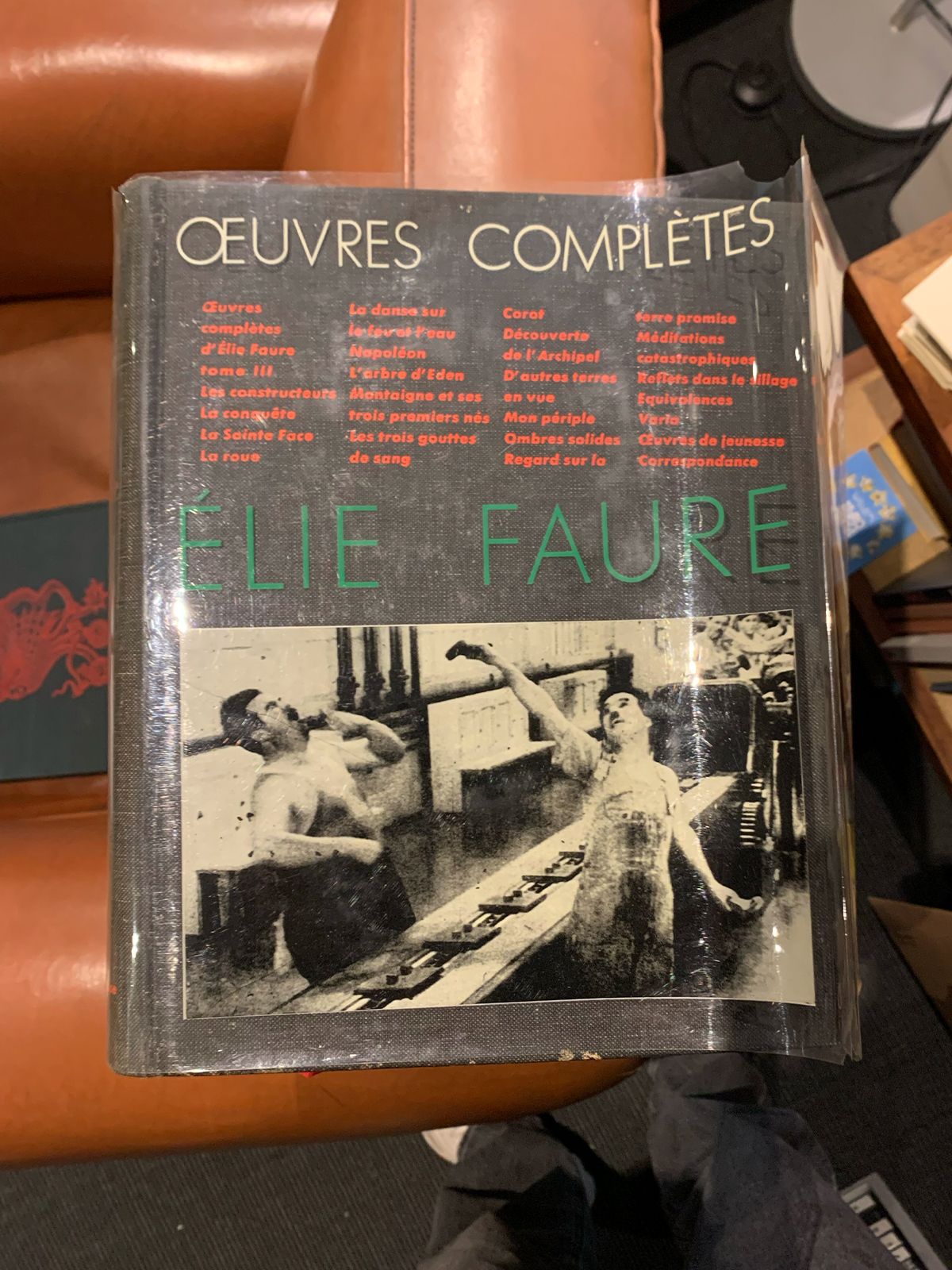
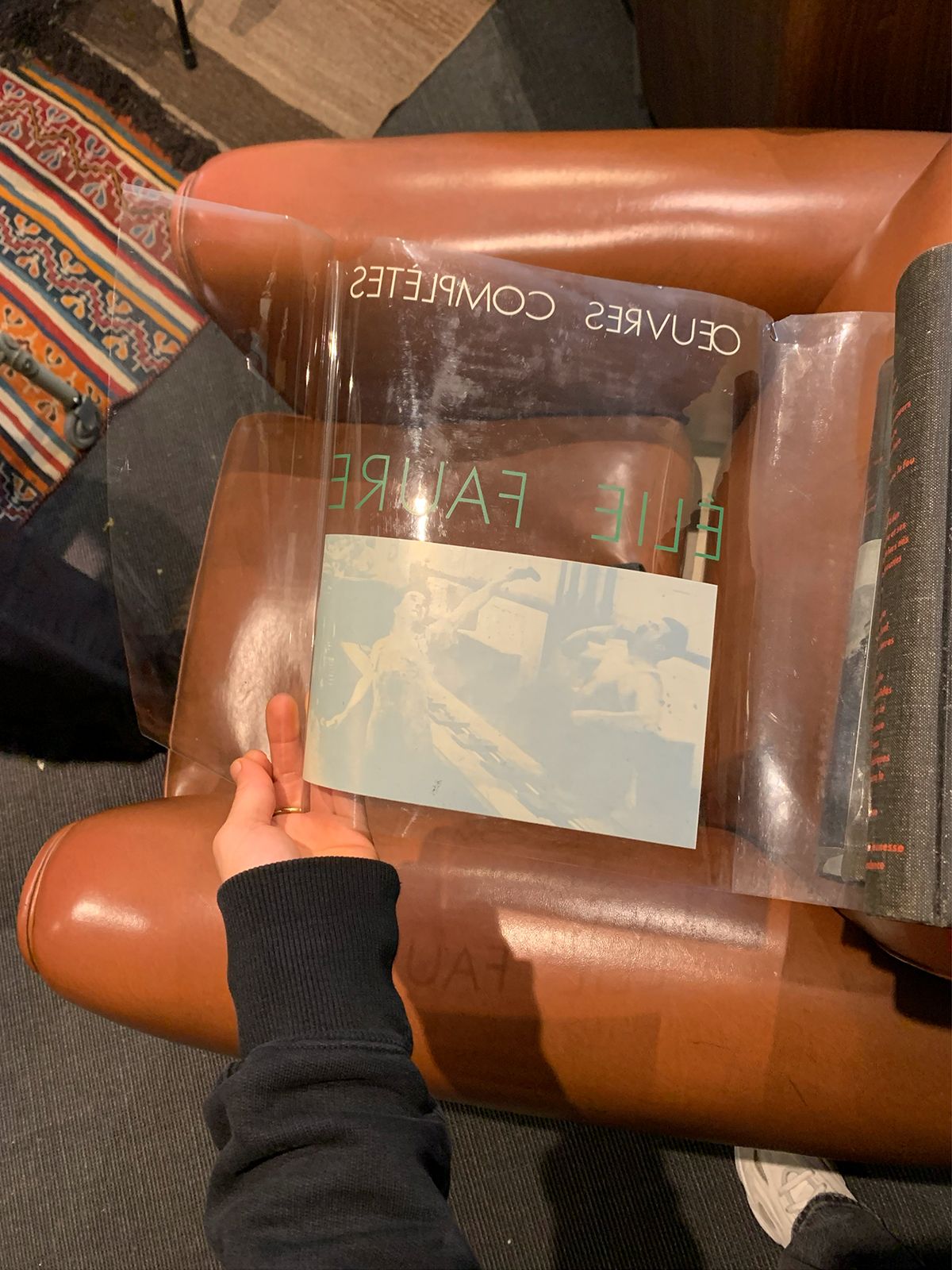
— This is heliogravure. The black is on the reverse, with a layer of white printed over it. It creates a kind of background for the image. I borrowed this trick from the Club for Ever Meulen’s Portfolio Ever Meulen, Belgian illustrator. At Futuropolis, he published Huiles sur papier (1984) and Feu vert (1987). . We played with transparencies by printing on tracing paper. It’s one of the worst nightmares, because tracing paper is very sensitive to humidity.
He fetches the pocket book from one of the Futuropolis shelves, opens it and pulls out a double-folded sheet.
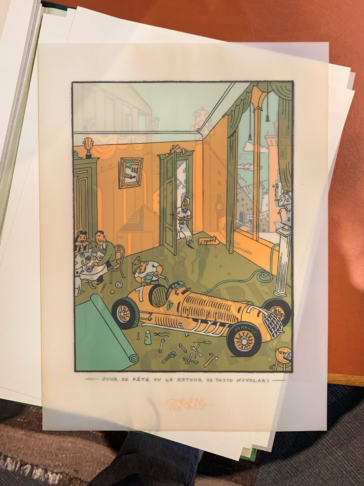
— We printed this at Union Imprimerie Union, French printer for modern and contemporary art from 1910 to 1995, in Paris. , the Rolls-Royce of printers, with an opaque white, just like here, behind the building in the illustration. And even though it’s tracing paper, you can’t see what’s underneath. You open it. And there’s the white.
He mimics the motion as he speaks, pointing to the white back of the building while I look at the scene revealed on the other side of the fold.
— The problem with tracing paper is you can’t register it properly. The grip has to be mechanical. I messed about with Ever Meulen and at the printer’s, it was moiré, it was a mess. While regular paper cost ten euros a kilo, tracing paper was eighty-five, ninety. Much more expensive. We printed once, twice, three times. Each time, we started over, and I ordered more tracing paper. We almost gave up at one point. Then one night, very late, the printer called me, “I’ve got it. Let’s do another run. I want to try something, I’ll buy the paper.” Overnight, he’d thought it through, sprayed a burst of black ink along the edge of the tracing paper stack. That left a micron of ink on each sheet, breaking the electronic beam so we could register it to within a tenth of a millimetre. I told him, “Great, send me the bill!” thinking “this is going to cost me a fortune…” I let it linger. Then he called me back, “I’m gifting you the whole print run for Ever Meulen. Thanks to you, I have perfected my spray system and have just landed a contract with the Ministry of Defence…”
What Robial recounts goes beyond mere technical prowess – though it certainly commands admiration. What he describes is a story of trust, of back and forth exchanges, of shared intuition. In the case of the Clubs, the texts were bought from other publishers, the authors were absent, and the publishers themselves were rarely involved in the production process. A vital connection was forged with the printer – the book designer’s true partner. It’s this relationship that Robial managed to extend and reinvent within his own company, Futuropolis.
I notice that it’s often in this dialogue with those who make the books that their quality is determined. Printers are the craftsmen of what we design: they are our collaborators. Their trade and tools have evolved, just as ours have, in step with technical innovations and shifts in production scale and speed. We’ve moved on from hand presses to automated lines: today, we print on eight-colour machines, recto-verso, with integrated drying, at ten thousand sheets an hour. The kind of exchanges that Robial mentioned are becoming rarer. Most of the books I design are printed abroad. Communication happens remotely. While paper, inks and printing techniques have diversified, without a deep understanding of production constraints – nurtured by genuine dialogue with those who make the books and by the history of the printing trades – this technical richness remains abstract. It is this knowledge, both practical and historical, that shapes the book’s form: a constant interplay between design and production, between graphic vision, technical skill and the memory of craftsmanship.
Before I leave, Robial shows me a rare book: Exercices de style Exercice de style by Raymond Queneau, author and co-founder of the literary group Oulipo, is a fragmented text in 99 chapters, each telling the same story in different ways. It explores variations in tone, style and vocabulary. by Raymond Queneau, designed by Faucheux.
— This was the ultimate challenge for all book designers. Someone should write a whole book just about all the editions of this title. The masterpiece is this one. It’s from the Club des libraires de France. One of the few Club books I paid a lot of money for. Queneau by Faucheux. I never found out whether it was distributed or sold like the others. You just never, ever find it. When you stumble upon it, you can’t let it go.
Same format as the rest of the collection, with a green spruce cloth cover and just the title screen-printed on the front board: unassuming from the outside. But inside, it’s Queneau’s own text that plays along: variations of tone, rhythm, and structure. The layout follows, accompanies, and amplifies these movements. As a student, I had been given this very assignment: pick a chapter and compose it into a small booklet.
To me, books are not merely finished objects: they are fragments of memory, witnesses to eras, gestures, and choices – some are visible, many silent. The tales that accompany them extend this material, enrich it, and give them new life. They offer a way to enter the minds of other people, to understand how constraints, collaborations and craftsmanship have shaped their forms. No book lives alone; it is always the product of a network of hands and minds – authors, publishers, designers, printers, binders, readers… It is within this constellation that graphic design finds its full meaning for me: never isolated, always in dialogue.
By exploring the Club books and talking with Robial, I had the opportunity to reconsider my own stance as a graphic designer – a profession constantly balancing the legacy of the past with the technical, cultural and social shifts of its time.
On my way home, reflecting on these past hours, I feel that my toolbox has expanded. It isn’t so much its contents that have changed, but the way I looked at them: how I organise them, what I seek in them, and what I see in them today, through the lens of my current experience and the questions I ask myself.